Marketing Site · Corporate · 2024
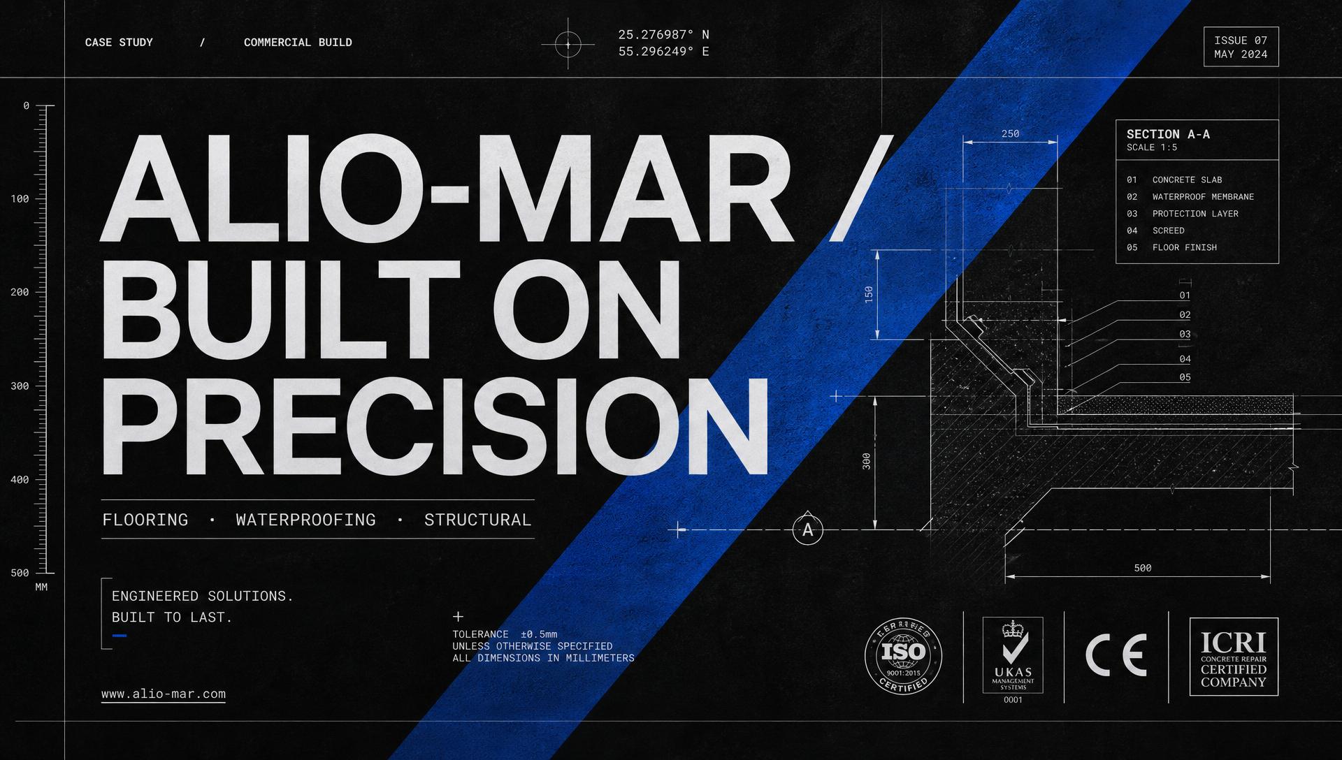
Alio-Mar — Construction Chemicals, Engineered for Trust
A full corporate site for an authorized construction-chemicals distributor — services, portfolio, blog, and a real contact loop — designed to feel as precise as the products it sells.
Alio-Mar Construction LLC
Product designer — IA, UX, UI, content structure, hand-off.
Eight fully-designed page templates and a shared component set (nav, service card, project card, stat, blog card, contact form, footer) that let a small marketing team publish services, showcase projects, and run a blog without breaking the brand.
The short version
Alio-Mar is an authorized distributor of construction chemicals and an approved contractor for flooring, waterproofing, structural strengthening, and other engineering solutions delivered to Global and European standards. I designed the full multi-page marketing site — Home, About, Services, Projects, Project Detail, Blog, Post Detail, and Contact — around three feelings the audience actually buys on: performance, durability, and trust. The visual language is deliberately technical — IBM Plex Mono for body, a single deep blue for actions, generous white space, and blueprint-grade rules that echo the site's construction context.
What was broken
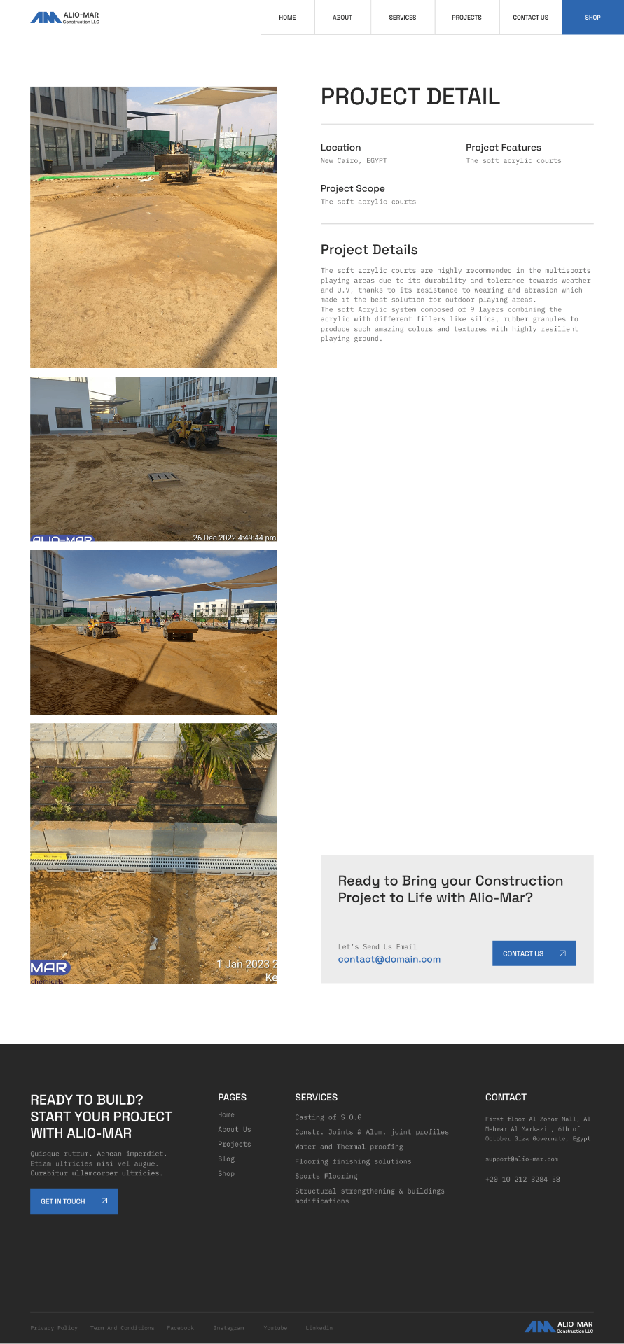
Every construction-chemicals company in the region ships the same site: a hero photo of a crane, a services grid nobody reads, a form that emails into a void. Alio-Mar needed to look like the disciplined, standards-driven company they are — with services explained in engineering terms, projects shown as real portfolio entries (location, scope, features, gallery), a blog that earns SEO, and a contact page that shows an office and a map. Everything had to be readable on a phone at a job site, and printable-clean enough to hand to a procurement officer.
Where it lived
Alio-Mar sells to engineers, contractors, and procurement teams — audiences who don't buy on vibes. They buy on certifications, past projects, product datasheets, and the sense that the company behind the pitch will still pick up the phone in year three. The old web presence was a single-page brochure with stock photography and no way to see actual project work. The team needed a real corporate site that could carry service depth, project proof, thought leadership, and a contact channel that felt human.
Rules I designed by
Technical, not decorative
IBM Plex Mono for body copy signals engineering discipline. No stock hero videos, no purple gradients — the site looks like the datasheets the audience already trusts.
Proof over promise
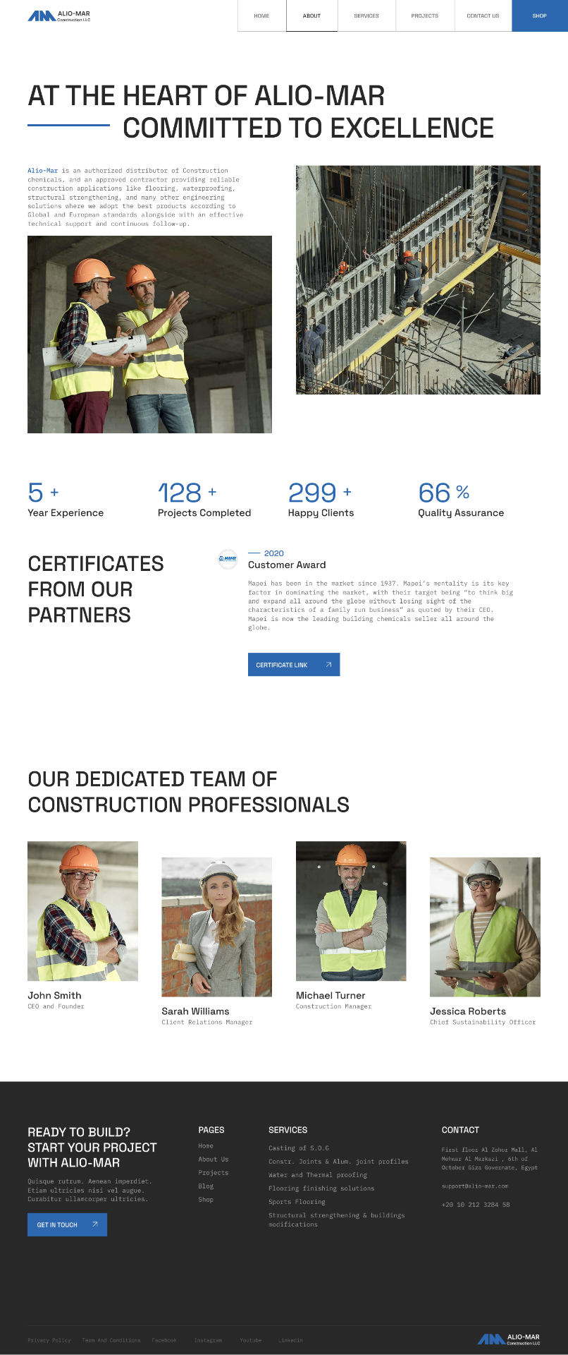
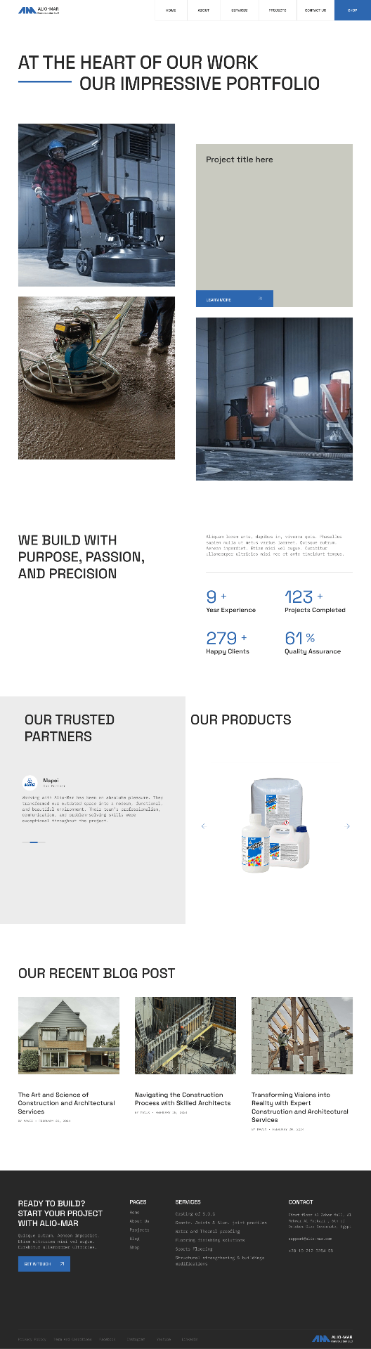
Every claim is anchored to a number (5+ years, 128+ projects, 66% QA) or a real project card. The Projects grid and Project Detail template exist to convert 'trust us' into 'look'.
One blue, used with intent
A single #1E5CD8 owns primary actions, active nav, stat numerals, and the Shop CTA. Nothing else competes for attention.
Split-title hero as a signature
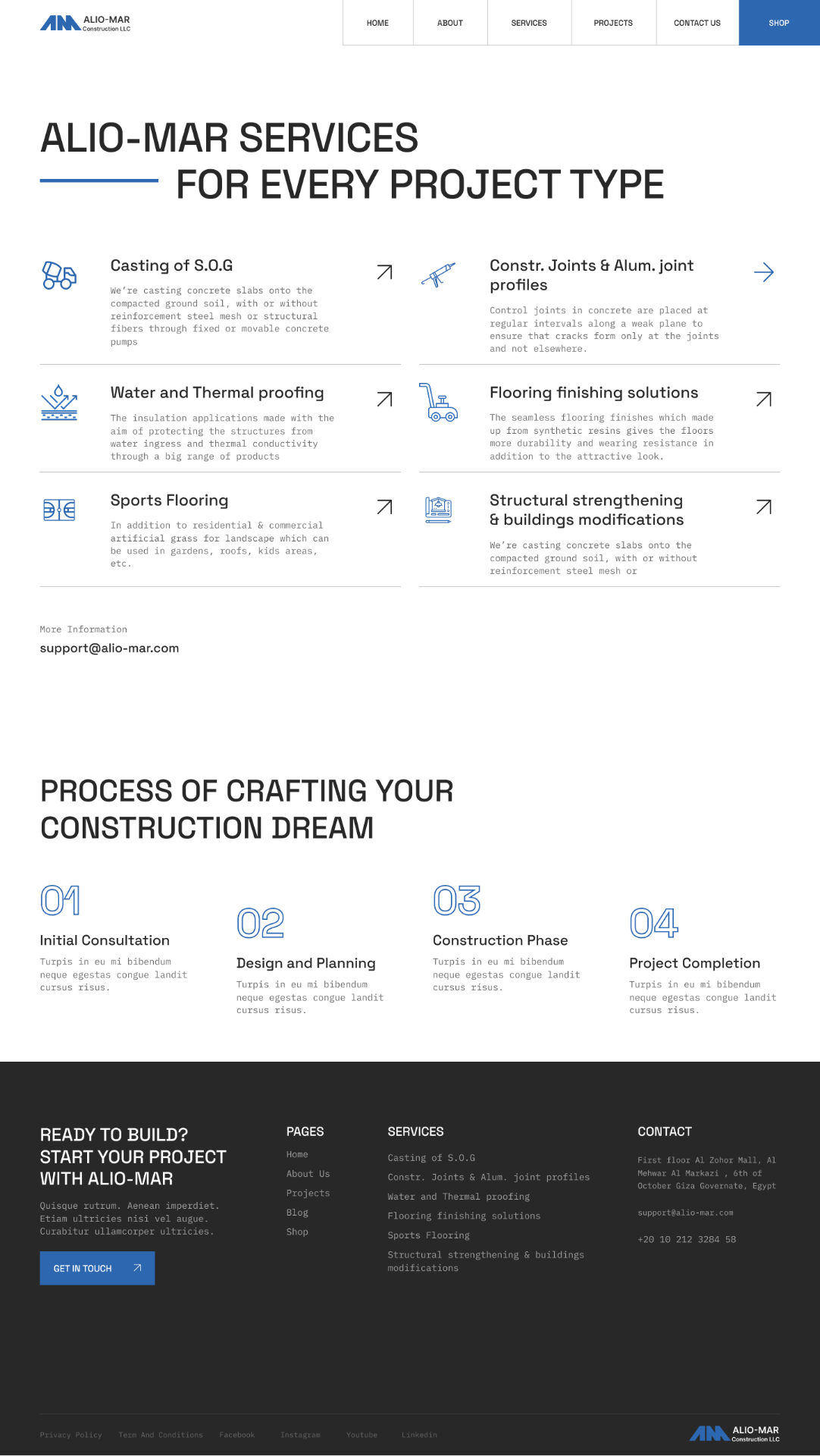
Every top-level page opens with a two-line title where the second line is indented and joined by a short blue rule. It becomes a spine the whole site is recognized by.
The footer does the work
Every page ends in the same dark footer — CTA, sitemap, services list, contact block. The site never dead-ends; readers always know the next move.
Step by step
Mapped the eight core templates against the buyer's journey — awareness (Home, Blog), consideration (Services, Projects), decision (Project Detail, Contact), retention (Post Detail, About).
The work itself

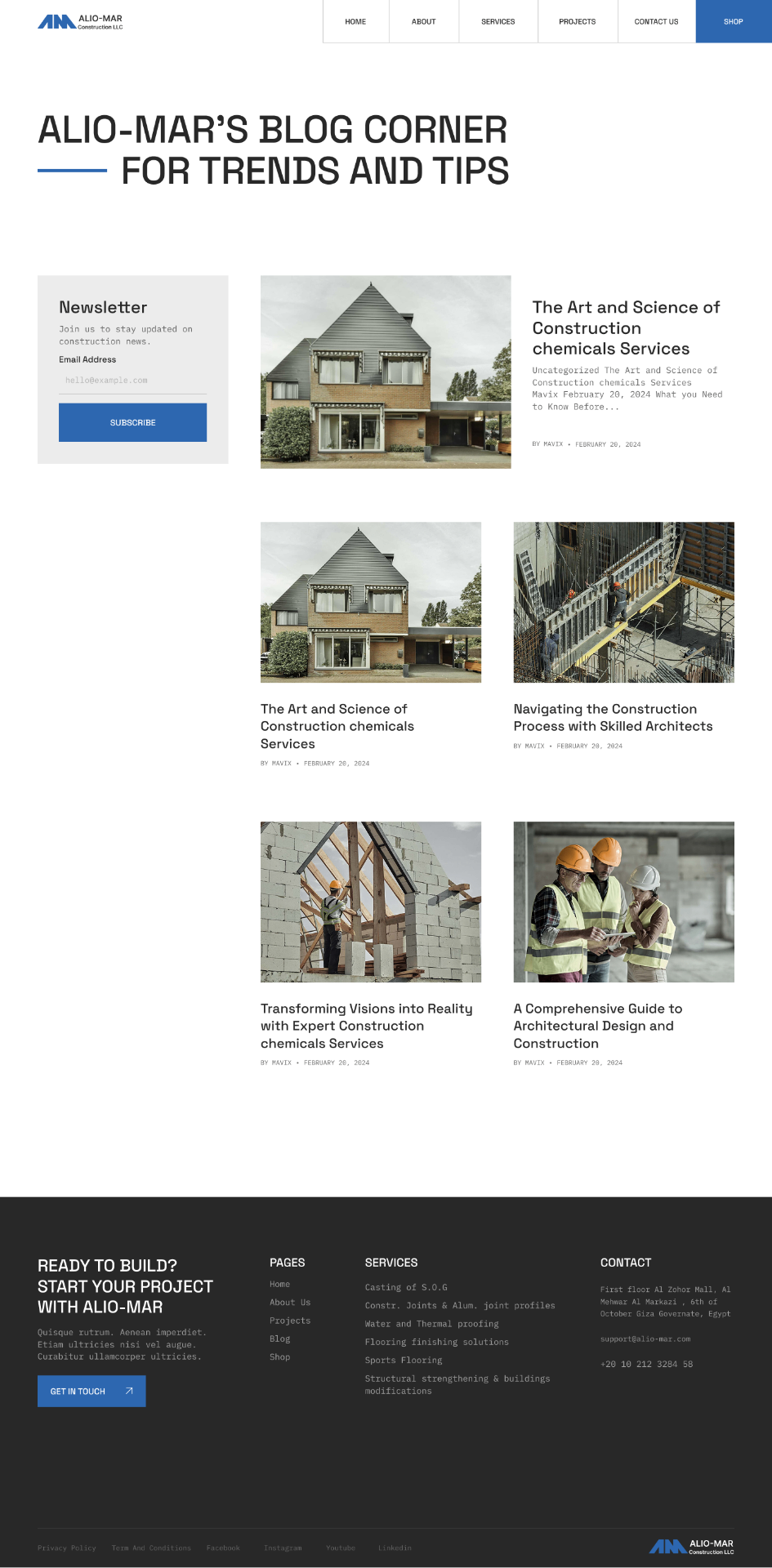
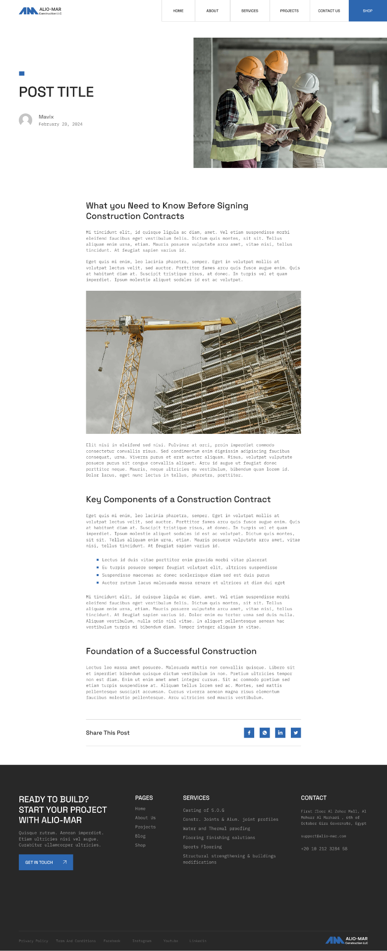
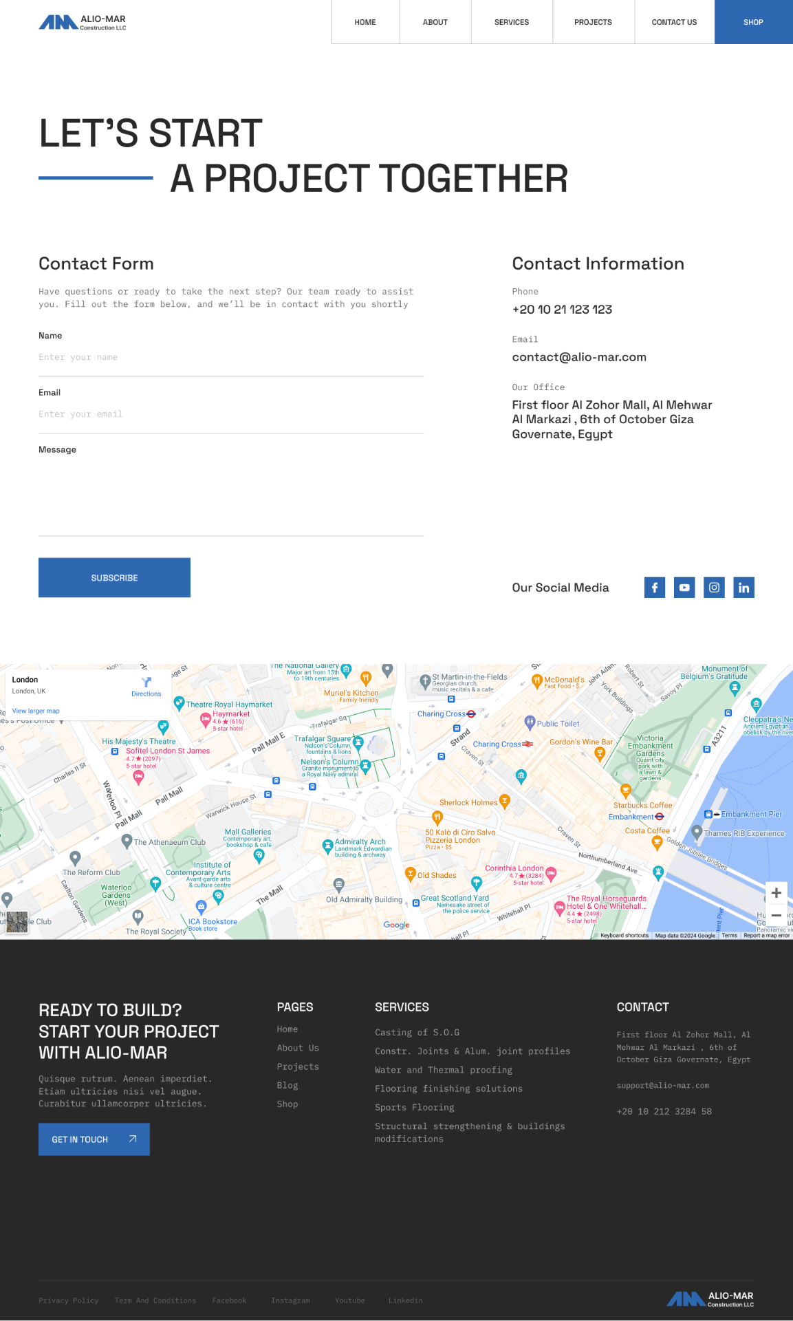
What I'd carry forwardCorporate construction sites default to stock imagery and vague copy because the audience is assumed to be uninterested in design. The Alio-Mar system inverts that assumption: engineers and procurement officers are among the most detail-oriented buyers on the internet, and a site that respects their vocabulary — mono type, numbered process steps, real project meta, dated certificates — wins their trust faster than any hero video. The template set is small on purpose (eight pages, one shared shell) so a two-person marketing team can keep it alive without a redesign every year.