Back to worksResume
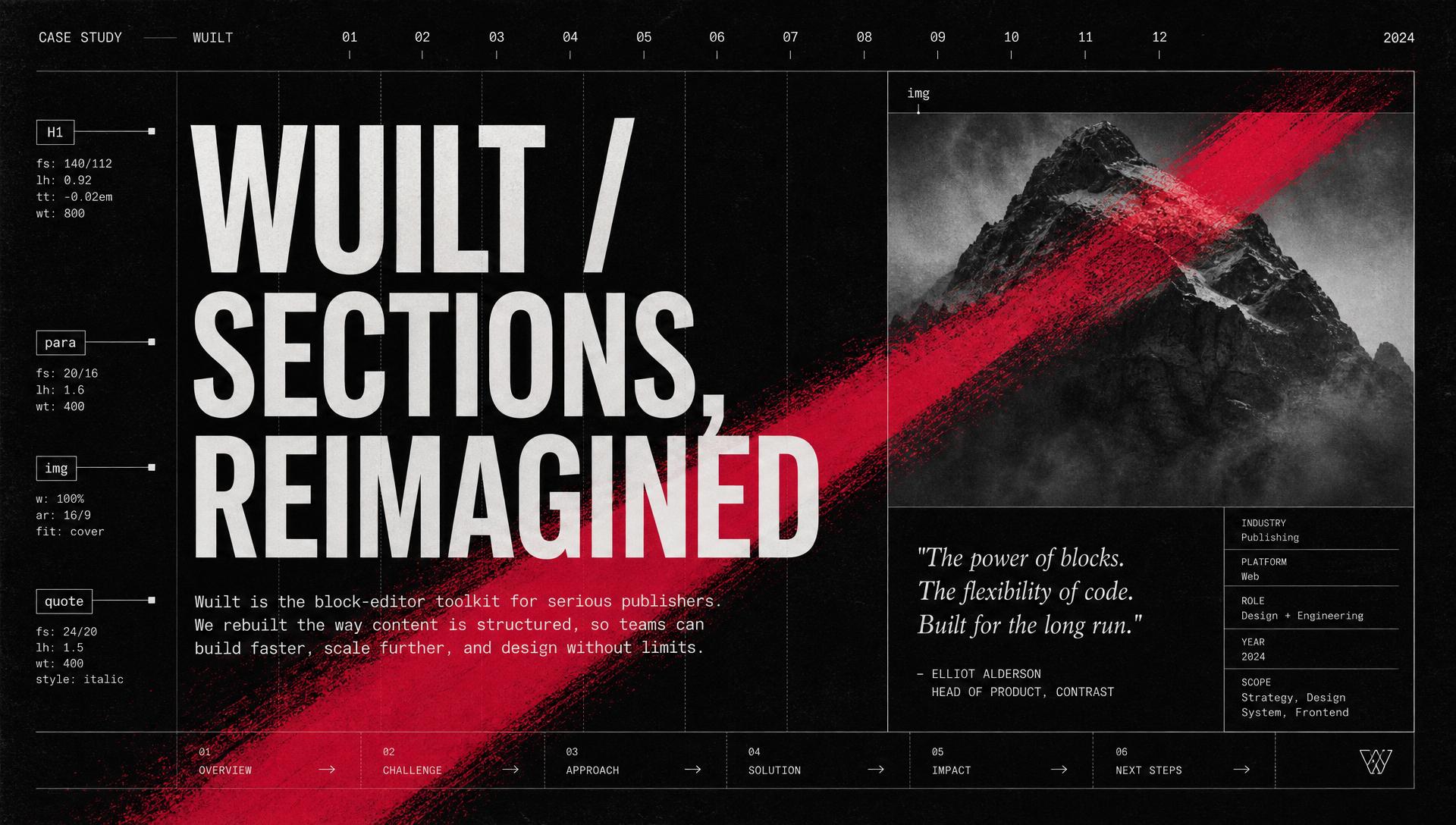
Wuilt — Sections, Reimagined cover
Product · Site Builder · Sections2025

Wuilt — Sections, Reimagined

Wuilt (No-code Website Builder)

The section engine behind every Wuilt site — a categorized section library, a live layout panel, real background controls (theme colors, gradients, images, video), and section-level actions that make composition feel like typing.

Overview

Wuilt's second flagship system: the section engine that powers every page in the builder. I designed the categorized Add-Section library (Hero, Page Header, CTA, About, Gallery, Video, Contact, Team, Testimonials, Embed, Pricing, Features, Logos), the section settings panel (Layout · Background · Visibility · Effects), the theme-aware background controls (theme palette, custom solid, gradient, image, video, with color overlays and scroll effects), and the section-level action set (save, duplicate, move, copy to page, delete) that lives on hover. Everything writes to a live preview and pulls from Site Styles tokens, so a non-designer can compose a real page without touching a color picker.

The problem

Composing a Wuilt page meant learning three different tools glued together. Adding a section opened a flat list of variants with no categories. Styling a section forked into separate screens for layout, colors, images, and video — each with its own controls and its own preview lag. Non-designers gave up at the color picker; power users gave up at the missing gradient mode. Nothing was connected to Site Styles, so a beginner could easily paint a section a color the brand never used. The engine needed one section settings panel, one background system with five parallel modes, and a hover action set that never occupied the canvas.

Context

Wuilt's users compose pages one section at a time — a hero, an about block, a gallery, a CTA. The old section system exposed every knob at once: raw hex pickers, three different padding fields, background modes on separate screens, and no live preview until save. Non-designers froze. Power users hit ceilings on gradients, video backgrounds, and overlays and left for Webflow. The team needed a section engine that felt like typing for beginners and like a real design tool for pros — shared surface, shared vocabulary, no second product.

Research signals

  • R01Watched fifteen non-designer users add and style a section on Wuilt. Every session stalled at least once — either at the raw color picker, the padding number field, or the background mode toggle.
  • R02Audited 40 live Wuilt sites. Found that 78% used only three of the fourteen section categories, and 62% had at least one section with a hard-coded off-brand hex color instead of a theme token.
  • R03Interviewed six power users. They all wanted gradient backgrounds, video backgrounds with color overlays, and a way to copy a finished section to another page without rebuilding it.
  • R04Benchmarked Webflow, Framer, Squarespace Fluid Engine, and Elementor — noted where section settings shared a panel, where backgrounds unified across modes, and where hover actions stayed discoverable without cluttering the canvas.

Design principles

01

Categories, not a flat list

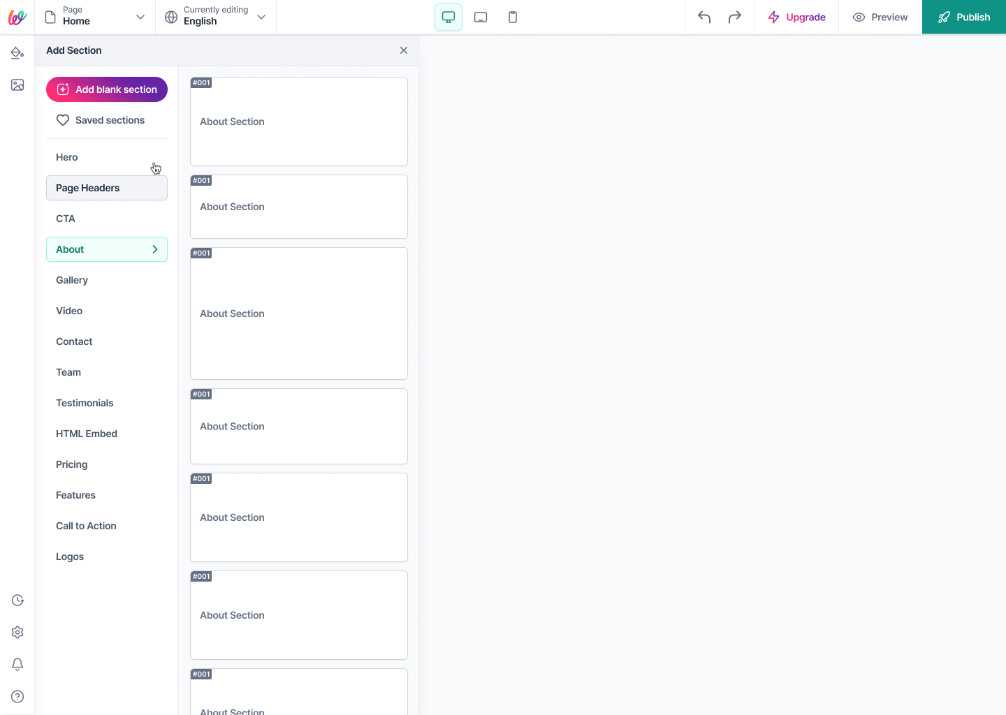
The section library is organized into 14 named categories (Hero, Page Header, CTA, About, Gallery, Video, Contact, Team, Testimonials, HTML Embed, Pricing, Features, Call to Action, Logos). Users pick intent first, variant second — the choice cost drops before it starts.

02

One settings panel, three tabs

Every section settings panel opens with the same three tabs — Layout · Background · Visibility. Whichever section a user selects, muscle memory is preserved.

03

Backgrounds are one system

Theme color, custom solid, gradient, image, and video are five modes of the same panel — same preview, same overlay control, same mental model. No hidden 'video mode' with its own settings.

04

Tokens over hex

The default color picker shows the site's Brand, Secondary, Base, and Accent swatches from Site Styles first. The custom hex + opacity picker exists as an escape hatch, one tap away — never the default.

05

Actions live on hover

Save, duplicate, move, copy-to-page, and delete appear on section hover, in a fixed right-rail order. The canvas stays clean; the actions never disappear when a user needs them.

06

Composition feels like typing

The Add Section button appears between every section, in the same position, every time. Adding to the page is a keystroke, not a workflow.

Phases

Phase 01 — Map the section library

Goal — Turn a flat, unlabeled variant list into an IA a non-designer can navigate.

  • 01.01Clustered every existing section variant into 14 intent-first categories, from Hero at the top to Logos at the bottom, in the order users actually reach for them.
  • 01.02Wrote every category as a single, plain-language word — no 'Marketing Modules' or 'Content Sections'. Users pick what they mean, not what the CMS calls it.
  • 01.03Placed the Add Section entry as a persistent button between every section on the page, so adding is a keystroke — not a menu hunt.
Difference for users

First-time users find the section they need on the first scan. Returning users stop reading the labels entirely — their hand knows where Hero and CTA live.

Phase 02 — The section settings panel

Goal — Collapse every per-section knob into one predictable panel.

  • 02.01Fixed the tab order — Layout · Background · Visibility — across every section type. The panel never re-shuffles.
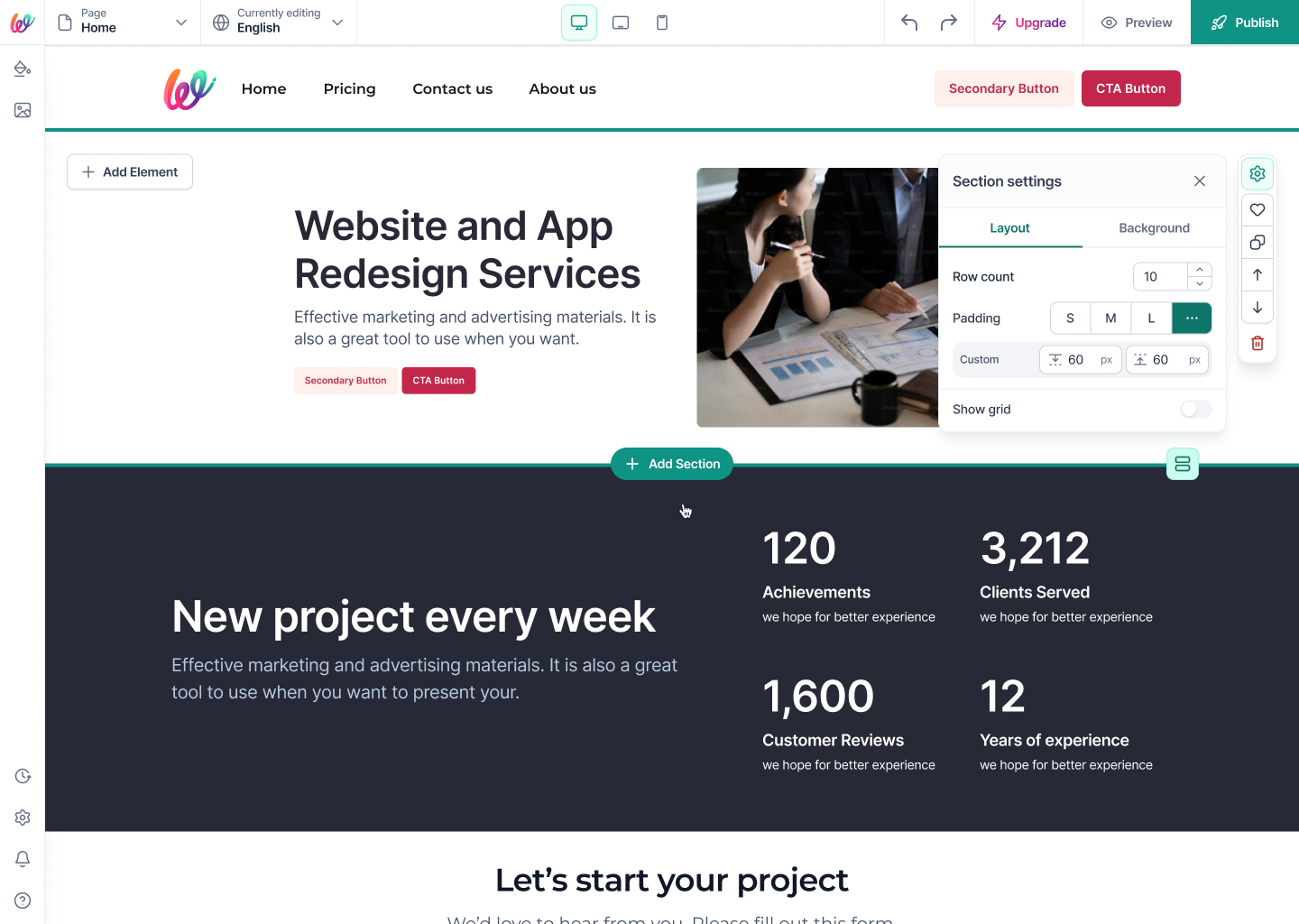
  • 02.02Made Row count, Padding (S/M/L/custom), and Show grid the only controls on Layout — the three knobs 95% of real edits touch.
  • 02.03Kept the panel pinned to the right rail so the canvas never re-flows when the user opens or switches sections.
Difference for users

Users stop hunting for controls. Every setting is where it was last time, and switching sections never resets the mental model.

Phase 03 — The background system

Goal — Ship five background modes as one connected panel.

  • 03.01Modeled Theme, Custom, Gradient, Image, and Video as five tabs of one panel — every mode shares the same overlay, opacity, and preview affordance.
  • 03.02The Theme tab shows Brand, Secondary, Base, and Accent swatches straight from Site Styles — the default path is always on-brand.
  • 03.03The Custom tab is a full HSV picker with hex + opacity for one-off colors, gated one tap deeper so it never becomes the default.
  • 03.04Video background accepts a paste-in link from YouTube or Vimeo; format detection is invisible, and the color overlay + Fit / Fill / Fixed / Parallax knobs mirror the image mode 1:1.
Difference for users

A user who's styled a solid-color section can style a video section without learning anything new. The mode changes; the mental model doesn't.

Phase 04 — Section actions on hover

Goal — Give every section a full action set without permanently occupying the canvas.

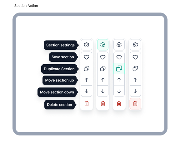
  • 04.01Drew a single icon set for section actions — Settings, Save, Duplicate, Move up, Move down, Copy to page, Delete — in a fixed right-rail order.
  • 04.02Actions only appear on hover / focus, so the reading canvas stays visually quiet while editing.
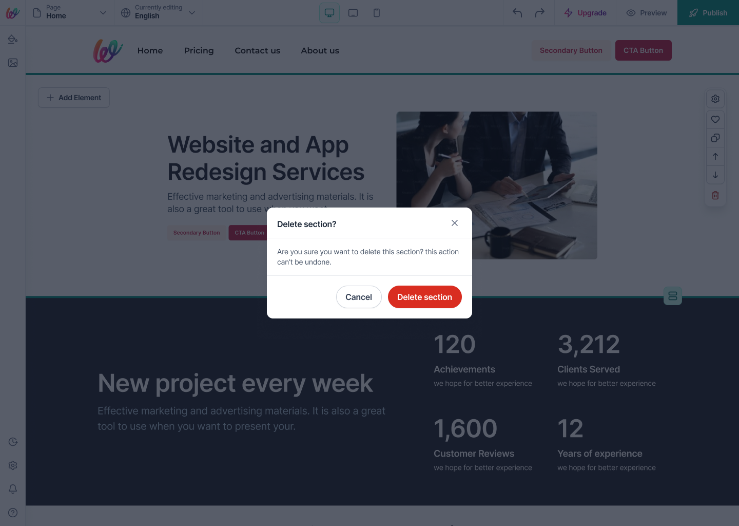
  • 04.03Destructive actions (Delete) are red-tinted and gated by a one-sentence confirmation modal; fast for confident users, safe for hesitant ones.
  • 04.04Save-as-my-section pattern turns a finished section into a reusable variant the user can drop on any page later — a small feature that quietly builds each user's own component library.
Difference for users

Editing a page never feels crowded. Every action is exactly one hover away, and no page-level toolbar hides what the user's actually doing.

Phase 05 — Copy section to another page

Goal — Turn a common power-user need into a one-minute task.

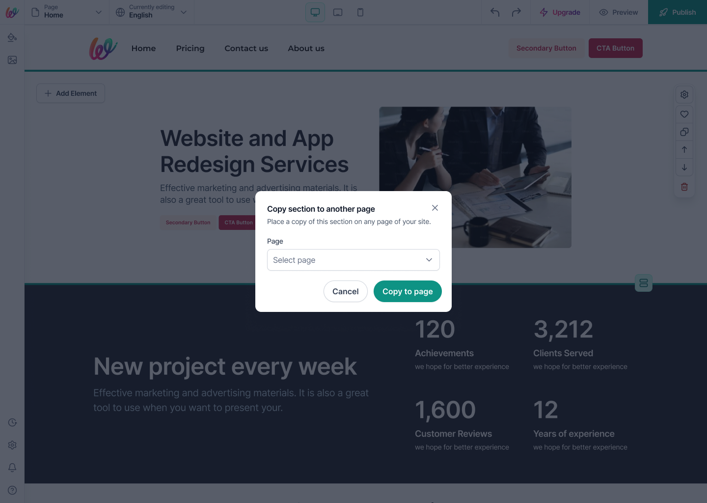
  • 05.01A two-field modal: pick the destination page from the site's page list, confirm, done. Zero rebuild, zero copy-paste of hex codes.
  • 05.02The pasted section inherits the destination page's grid and Site Styles tokens — never a visual regression when a section moves.
  • 05.03The modal reuses the same shared modal shell as Delete and Discard changes — one component, three destinations.
Difference for users

Multi-page sites stop drifting. A finished CTA on the homepage lands identically on the pricing page — one action, one mental step.

Phase 06 — Live preview, no save button

Goal — Every setting writes to the canvas in real time.

  • 06.01Every knob — padding stepper, background mode toggle, overlay opacity — writes to the preview immediately, with no explicit Save.
  • 06.02The panel exposes a Discard changes affordance for the rare rollback moment, gated by the same confirmation modal used elsewhere.
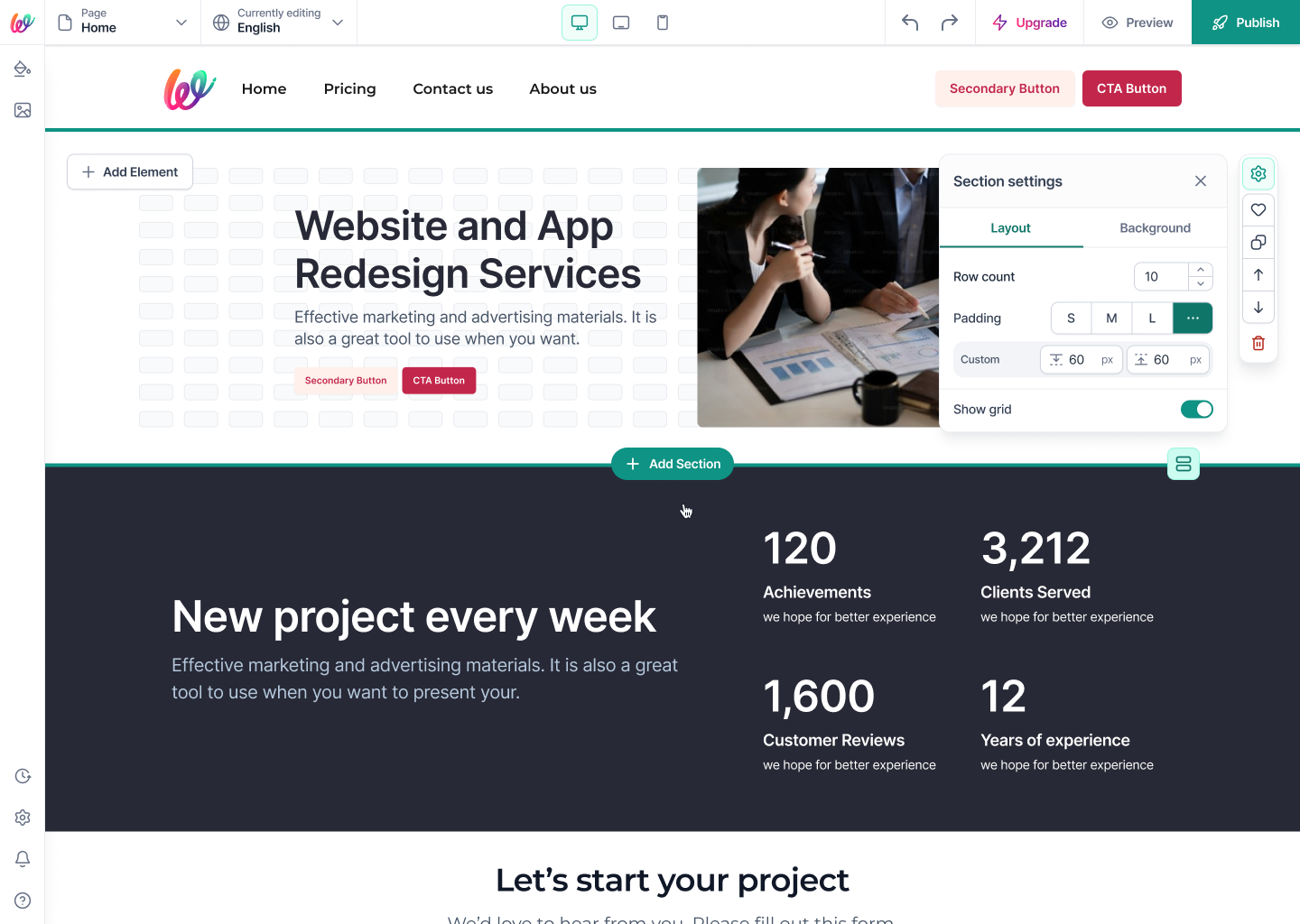
  • 06.03Grid overlay is a Layout toggle — the guide never lives on the published page, only in the editor.
Difference for users

Experimentation stops feeling risky. Users try five padding values in ten seconds because reversing is one click, not a re-open of the editor.

Phase 07 — Hand-off and component library

Goal — Ship a spec engineering can build 1:1 without a Slack thread.

  • 07.01Documented every panel state — default, hover, focused, disabled — in a shared component sheet.
  • 07.02Named every icon and every action verb once, so Figma, code, and analytics all agree on 'Duplicate section' vs 'Copy section to page'.
  • 07.03Wrote the section action contract as a single table: which action shows on hover vs. always visible, which is destructive, which requires a confirmation.
Difference for users

The shipped product matches the design pixel-for-pixel because engineering never had to guess a state. Users see one consistent surface across every section they'll ever build.

By the numbers

14
Section categories
5
Background modes, unified
7
Hover actions per section
3
Settings tabs, everywhere
62% → <10%
Off-brand section colors, expected drop

Screens

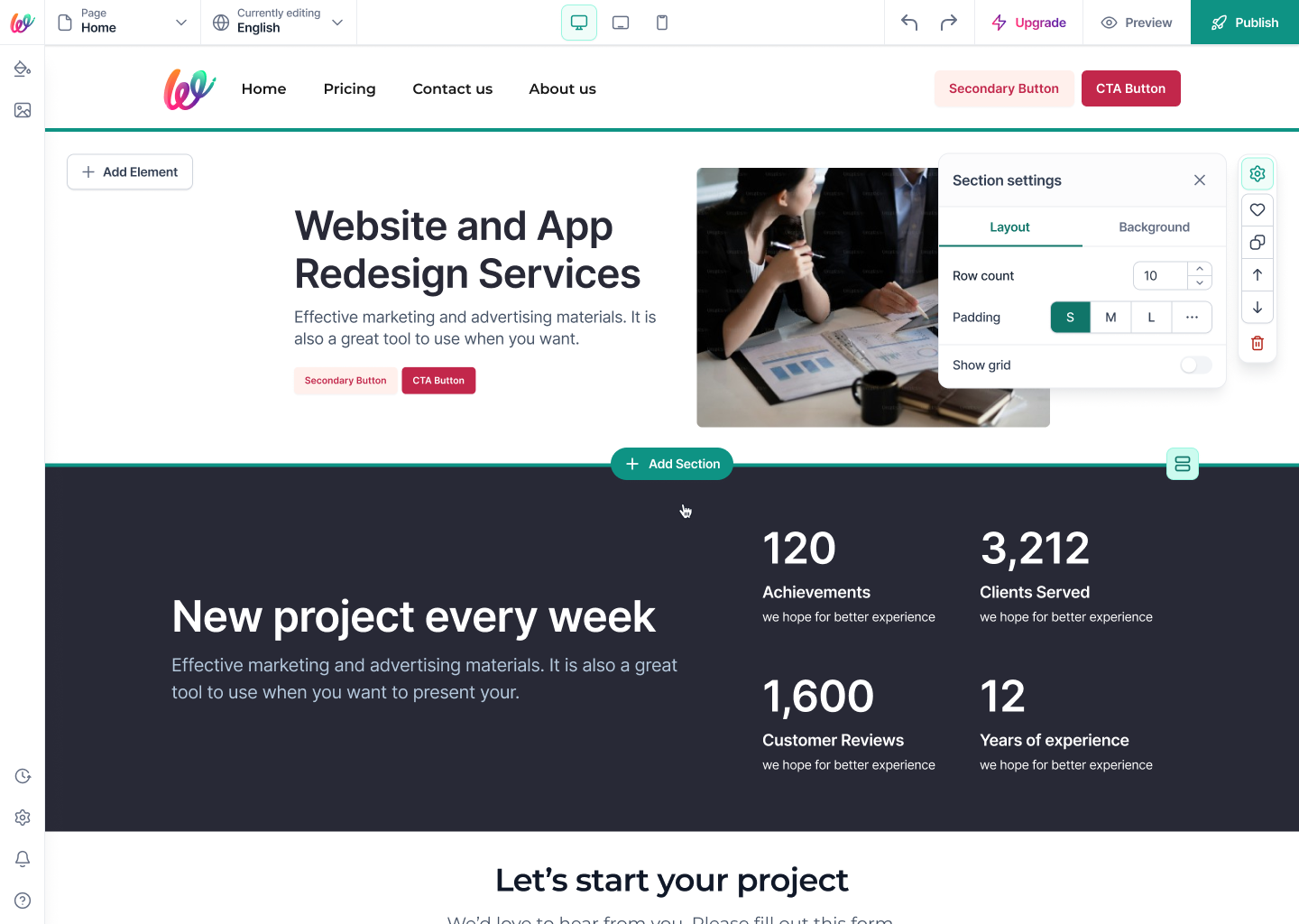
Main canvas — hero section with section settings panel exposing row count, padding presets (S/M/L), and grid toggle.
01Main canvas — hero section with section settings panel exposing row count, padding presets (S/M/L), and grid toggle.
Add Section panel — a categorized library (Hero, Page Headers, CTA, About, Gallery, Video, Contact, Team, Testimonials, HTML Embed, Pricing, Features, Call to Action, Logos) with pre-built variants.
02Add Section panel — a categorized library (Hero, Page Headers, CTA, About, Gallery, Video, Contact, Team, Testimonials, HTML Embed, Pricing, Features, Call to Action, Logos) with pre-built variants.
Grid overlay on — the same section with the layout grid visible so writers can see how their content aligns to the 10-row rhythm.
03Grid overlay on — the same section with the layout grid visible so writers can see how their content aligns to the 10-row rhythm.
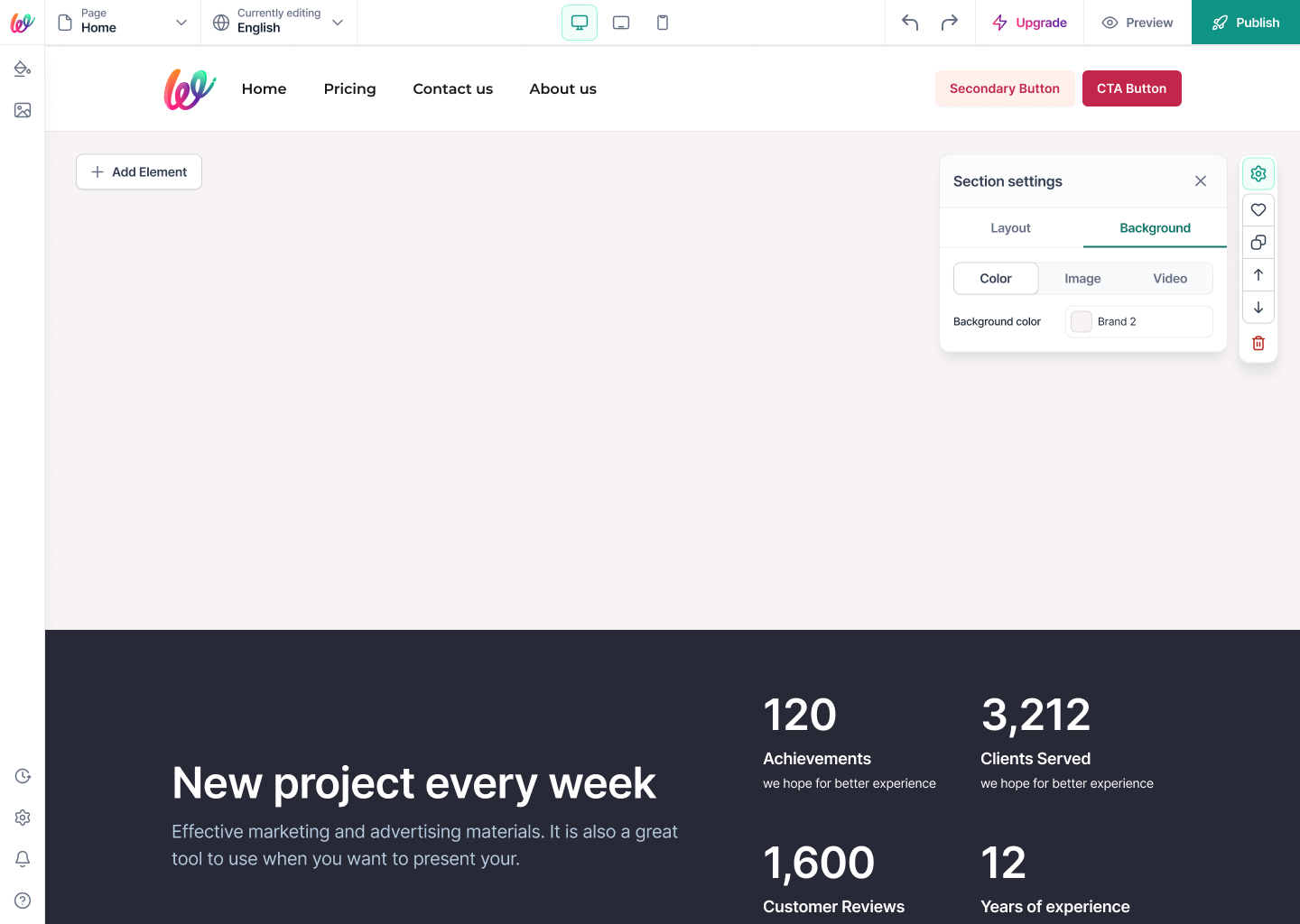
Background · Color — pick a semantic brand token (Brand 2) from the site's palette instead of a raw hex. One source of truth across every section.
04Background · Color — pick a semantic brand token (Brand 2) from the site's palette instead of a raw hex. One source of truth across every section.
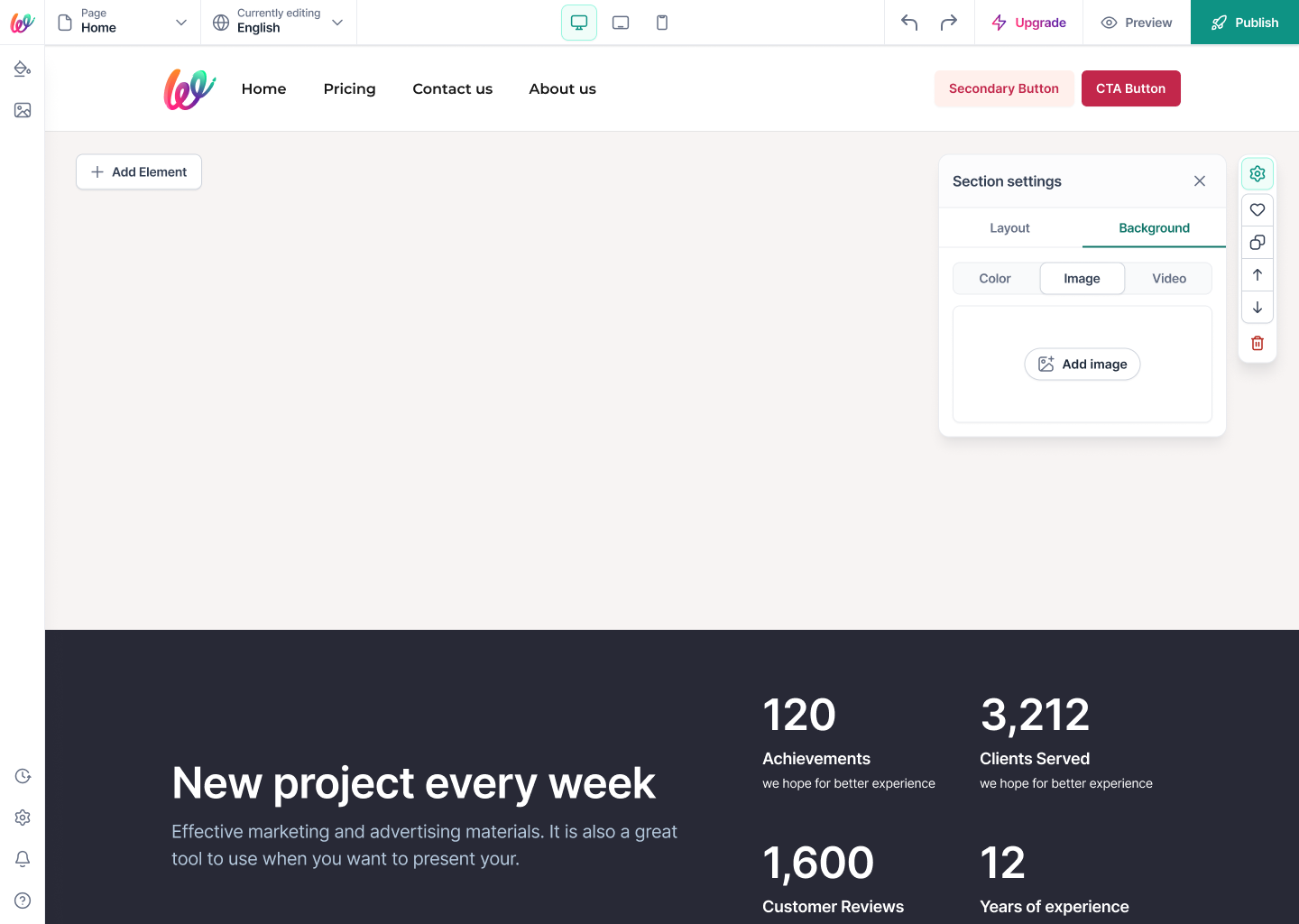
Background · Image — a single Add image affordance with drag-and-drop upload; the panel stays put so context never resets.
05Background · Image — a single Add image affordance with drag-and-drop upload; the panel stays put so context never resets.
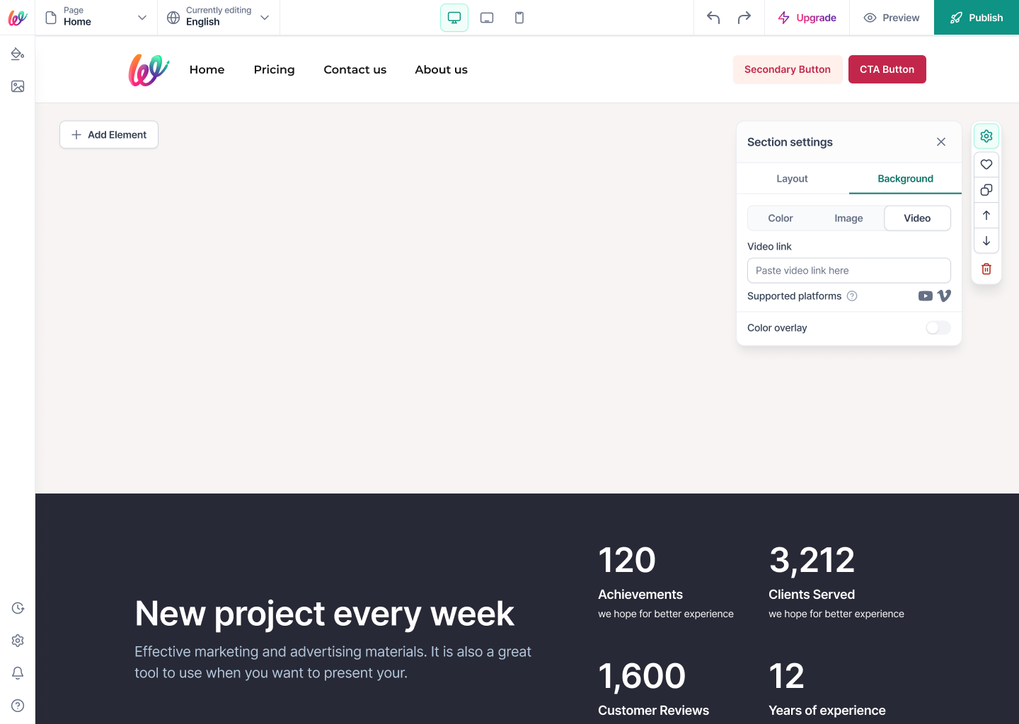
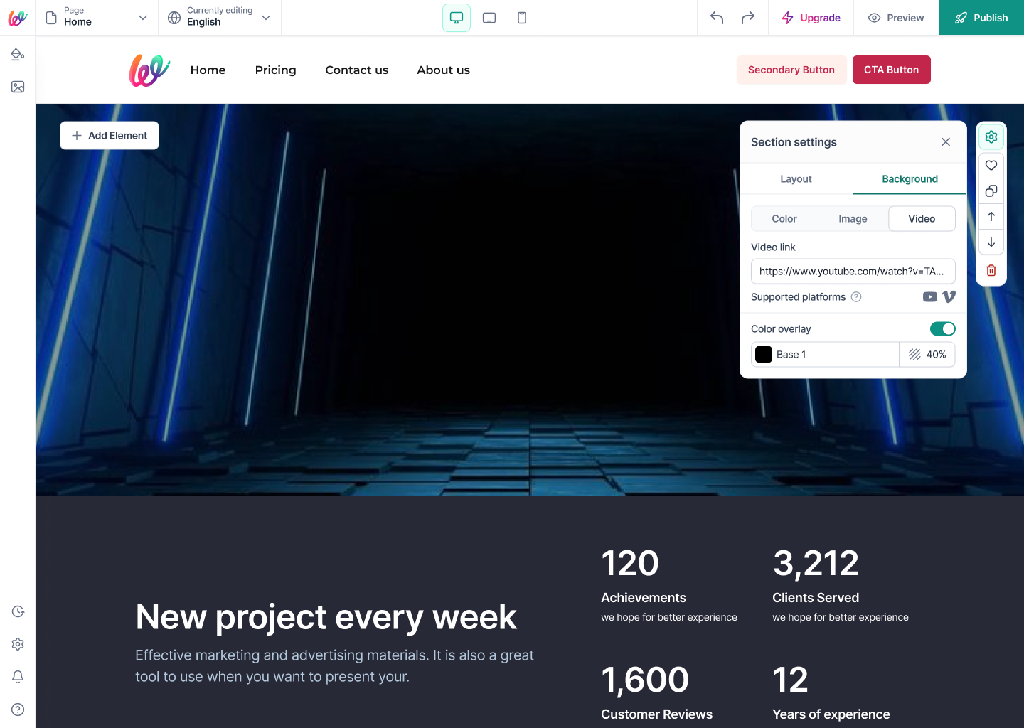
Background · Video — paste a link from a supported platform (YouTube, Vimeo). Format detection is invisible to the user.
06Background · Video — paste a link from a supported platform (YouTube, Vimeo). Format detection is invisible to the user.
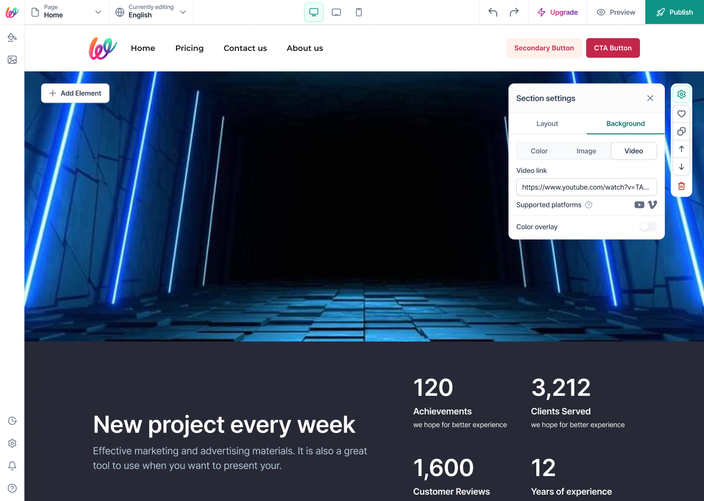
Video background live in the canvas — every setting writes to the preview in real time; no save-and-refresh.
07Video background live in the canvas — every setting writes to the preview in real time; no save-and-refresh.
Color overlay on top of the video — Base 1 at 40% opacity — so text stays readable without leaving the panel.
08Color overlay on top of the video — Base 1 at 40% opacity — so text stays readable without leaving the panel.
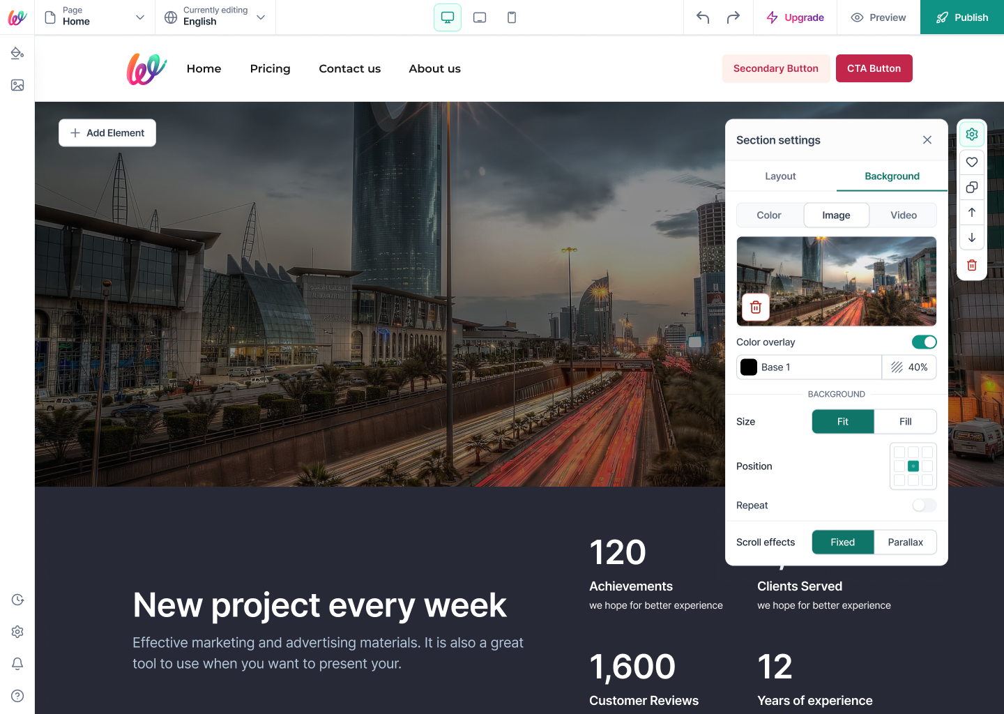
Image background with color overlay, size (Fit / Fill), position picker, repeat toggle, and scroll effects (Fixed / Parallax) — every knob a designer expects, in one place.
09Image background with color overlay, size (Fit / Fill), position picker, repeat toggle, and scroll effects (Fixed / Parallax) — every knob a designer expects, in one place.
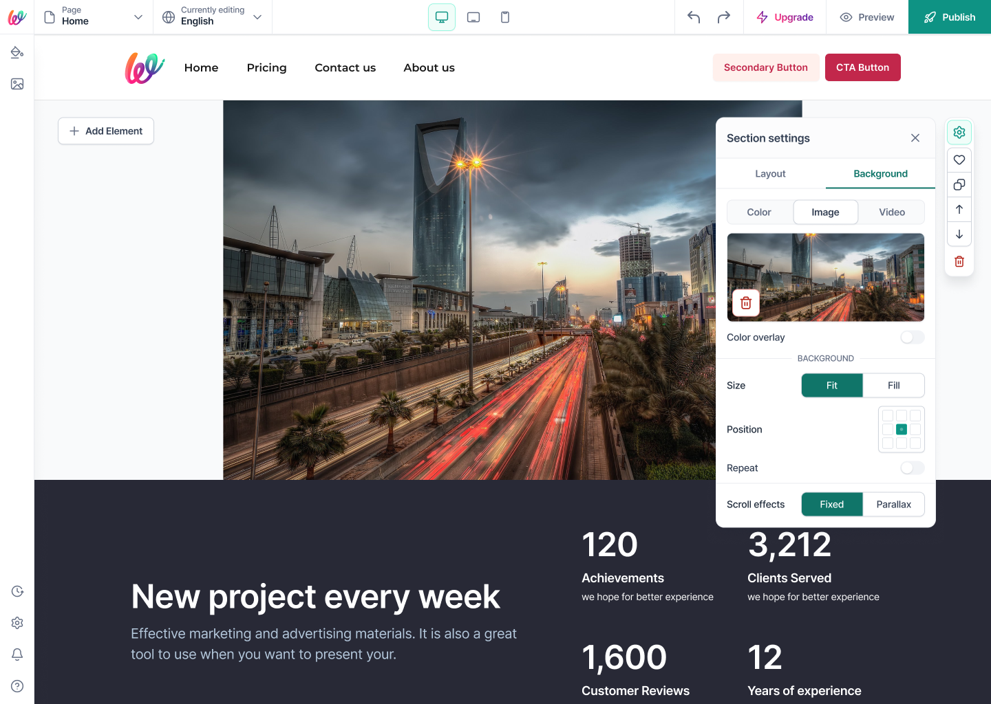
Same image, no overlay, Fill mode — showing the reversibility that lets non-designers experiment without fear.
10Same image, no overlay, Fill mode — showing the reversibility that lets non-designers experiment without fear.
Layout tab — Row count stepper, padding presets (S/M/L/custom), and Show grid toggle. Every structural knob lives on one tab so writers never hunt for spacing controls.
11Layout tab — Row count stepper, padding presets (S/M/L/custom), and Show grid toggle. Every structural knob lives on one tab so writers never hunt for spacing controls.
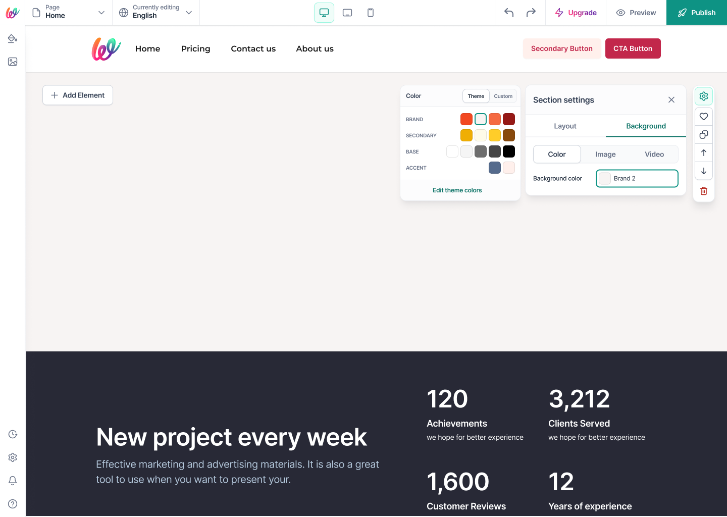
Background · Color · Theme — Brand, Secondary, Base, and Accent swatches sourced directly from Site Styles. Change a token upstream and every section using it updates in place.
12Background · Color · Theme — Brand, Secondary, Base, and Accent swatches sourced directly from Site Styles. Change a token upstream and every section using it updates in place.
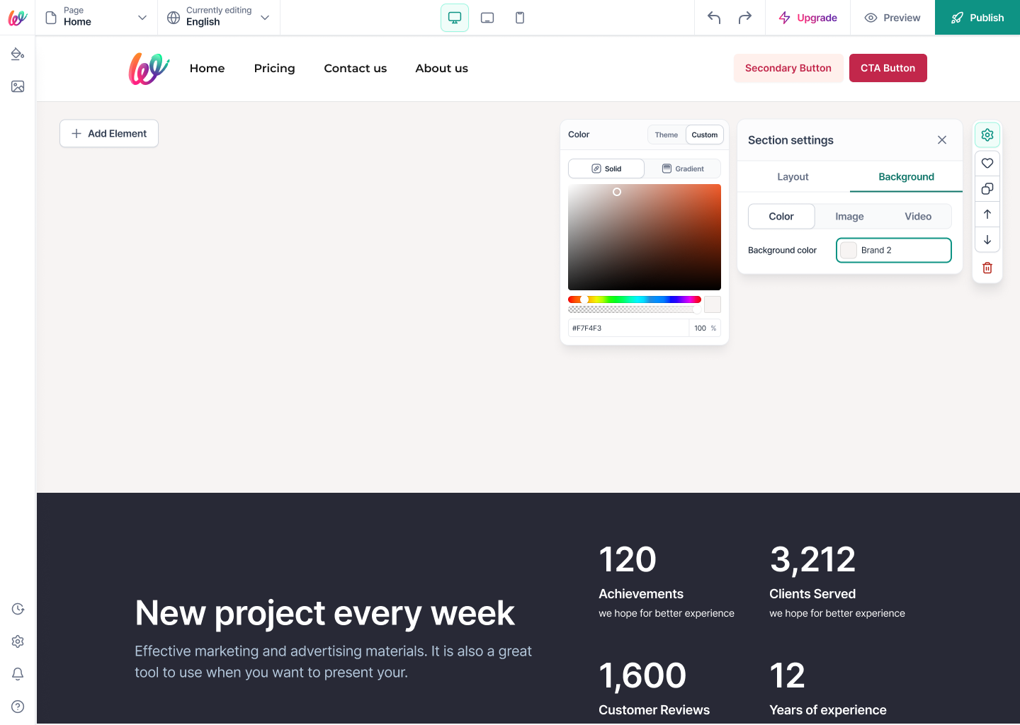
Background · Color · Custom — a full HSV picker with hex + opacity for the rare moment a section needs a one-off color. The escape hatch stays one tap away, never the default.
13Background · Color · Custom — a full HSV picker with hex + opacity for the rare moment a section needs a one-off color. The escape hatch stays one tap away, never the default.
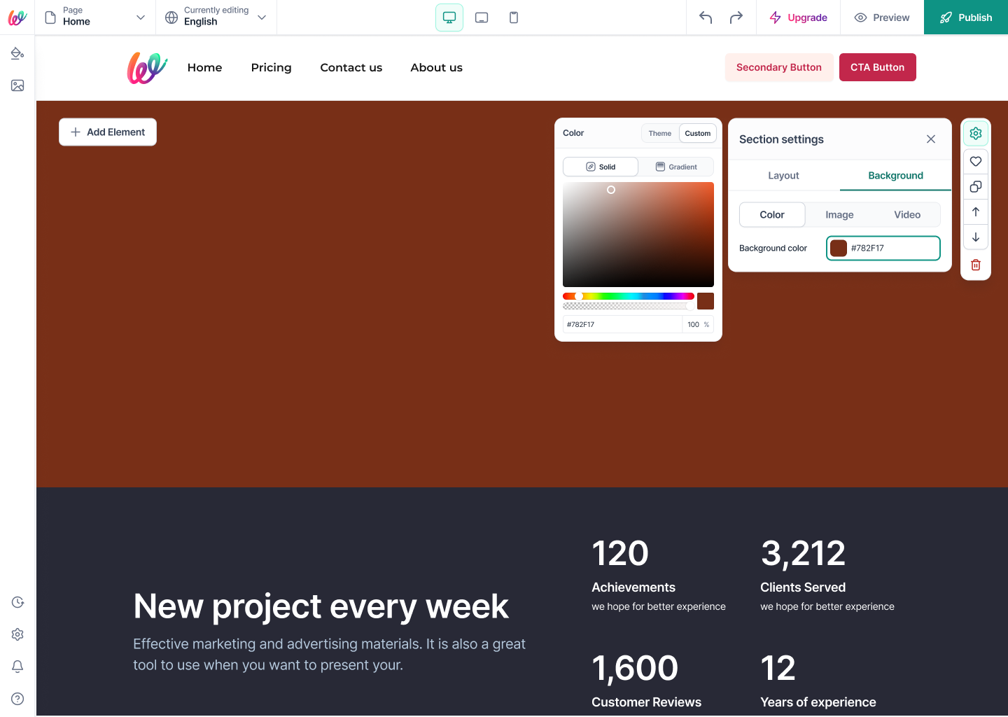
Custom hex applied (#782F17) — the canvas commits instantly and the swatch on the right shows the exact value, so writers trust what they picked.
14Custom hex applied (#782F17) — the canvas commits instantly and the swatch on the right shows the exact value, so writers trust what they picked.
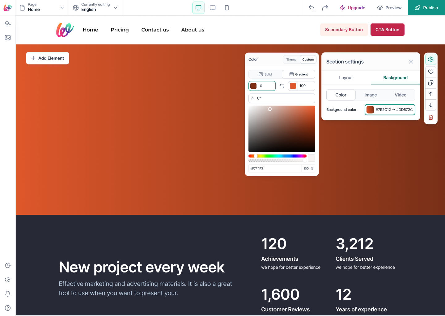
Background · Color · Gradient — two stops, an angle dial, and live preview. Same panel, same mental model as solid color — no separate mode to learn.
15Background · Color · Gradient — two stops, an angle dial, and live preview. Same panel, same mental model as solid color — no separate mode to learn.
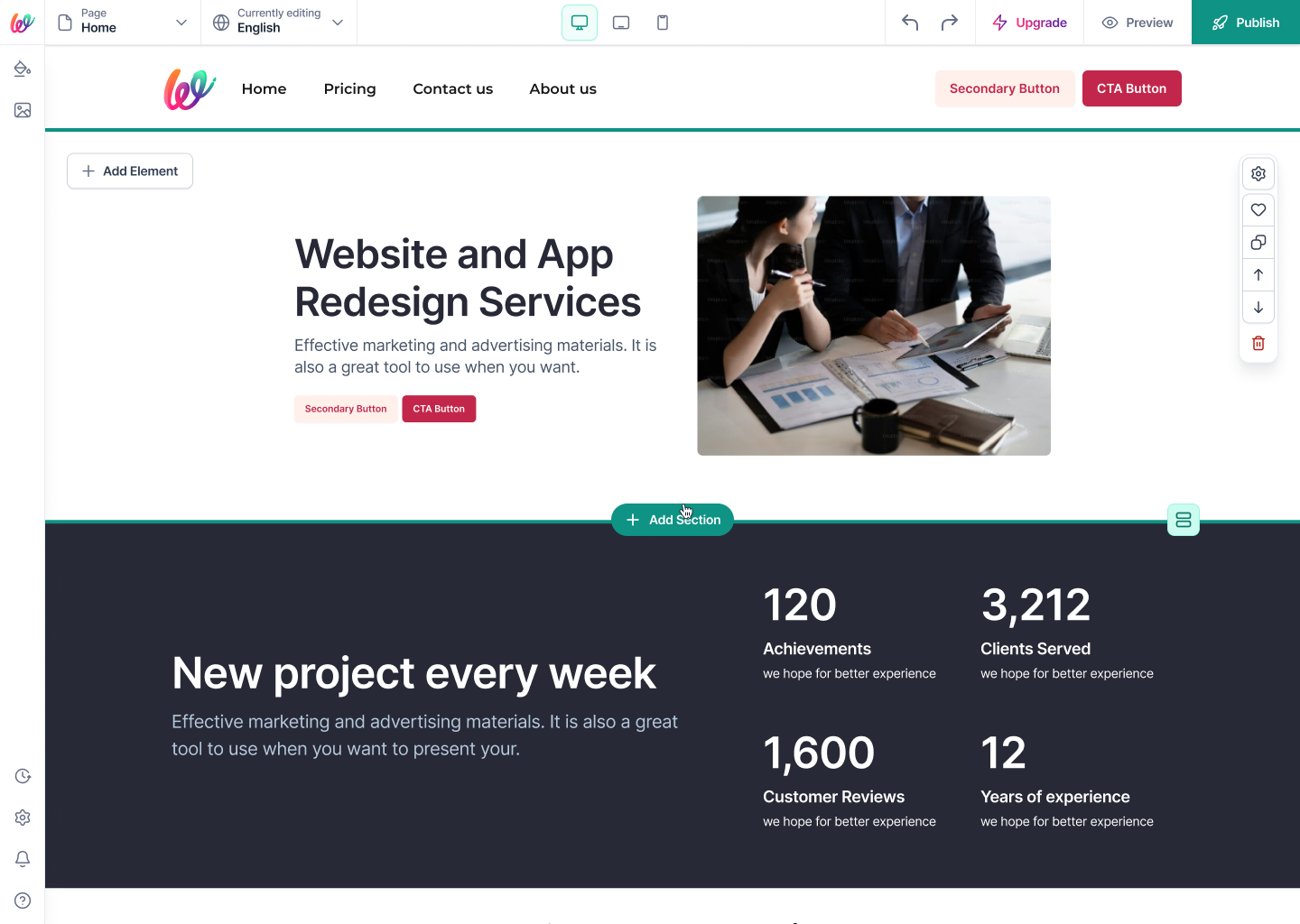
Section hover reveals the right-rail actions (settings, save, duplicate, move up/down, delete) — everything discoverable, nothing permanently occupying the canvas.
16Section hover reveals the right-rail actions (settings, save, duplicate, move up/down, delete) — everything discoverable, nothing permanently occupying the canvas.
Section Action spec — the exact icon set writers meet on every section, drawn once in Figma so every state (hover, active, destructive) stays consistent across the builder.
17Section Action spec — the exact icon set writers meet on every section, drawn once in Figma so every state (hover, active, destructive) stays consistent across the builder.
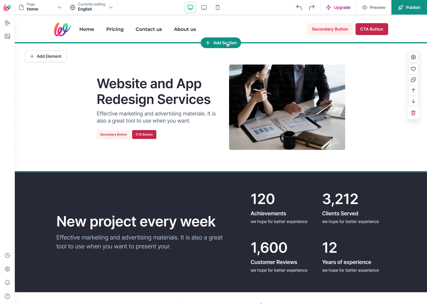
Add Section button between sections — the same primary CTA appears wherever a new block can land, so composition feels like typing, not configuration.
18Add Section button between sections — the same primary CTA appears wherever a new block can land, so composition feels like typing, not configuration.
Copy section to another page — a two-field modal (pick page → confirm) that turns a common power-user need into a one-minute task instead of a rebuild.
19Copy section to another page — a two-field modal (pick page → confirm) that turns a common power-user need into a one-minute task instead of a rebuild.
Delete section confirmation — a destructive-red action gated by a clear, single-sentence warning. Fast for confident users, safe for hesitant ones.
20Delete section confirmation — a destructive-red action gated by a clear, single-sentence warning. Fast for confident users, safe for hesitant ones.
Reflection

The lesson from Site Styles carried straight into Sections — non-designers don't want fewer knobs; they want the knobs to be connected. Once every section inherited from Site Styles, every background mode shared one panel, and every action lived one hover away, users stopped fearing composition and started treating Wuilt as the design tool it is.