Back to worksResume
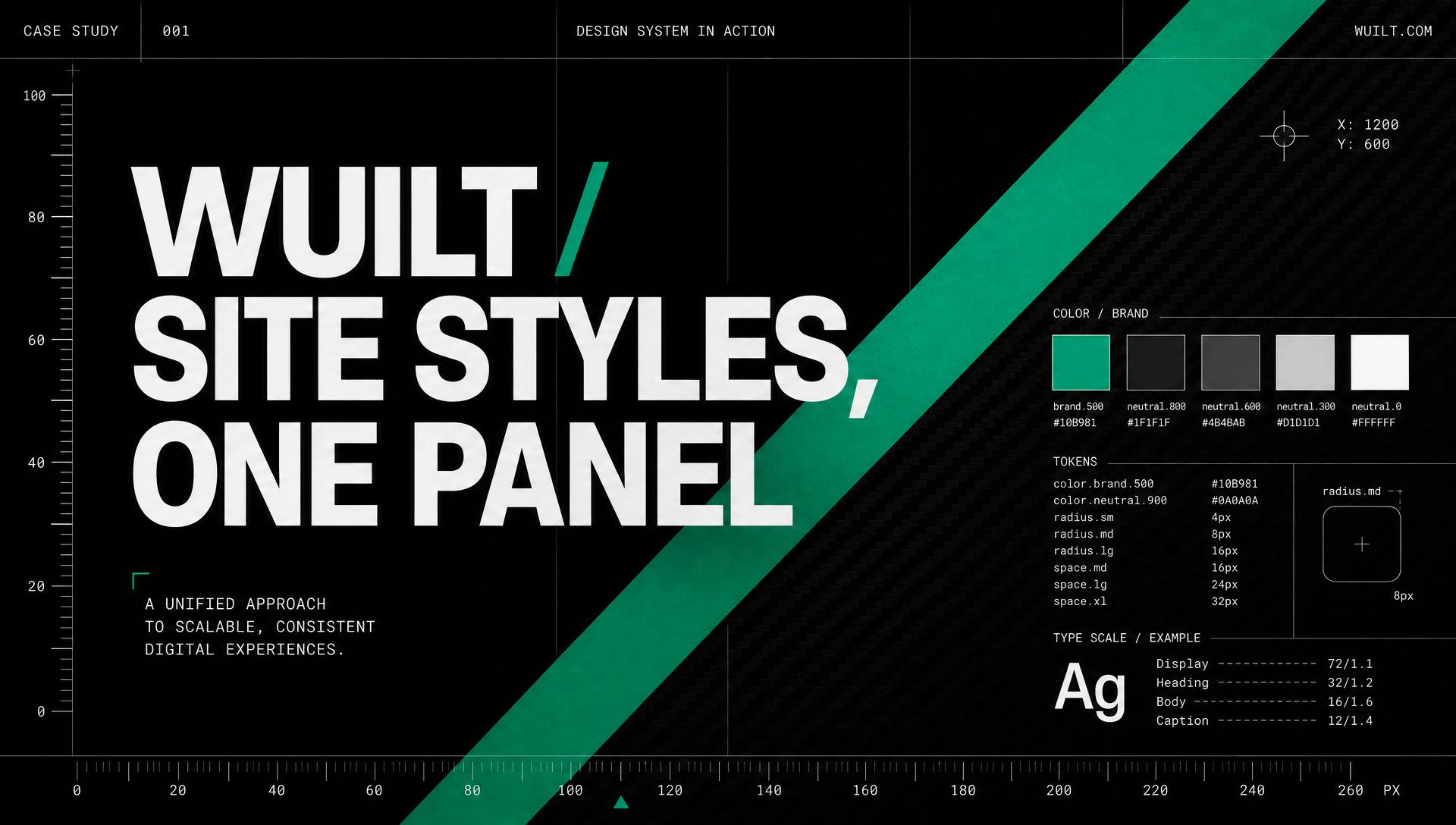
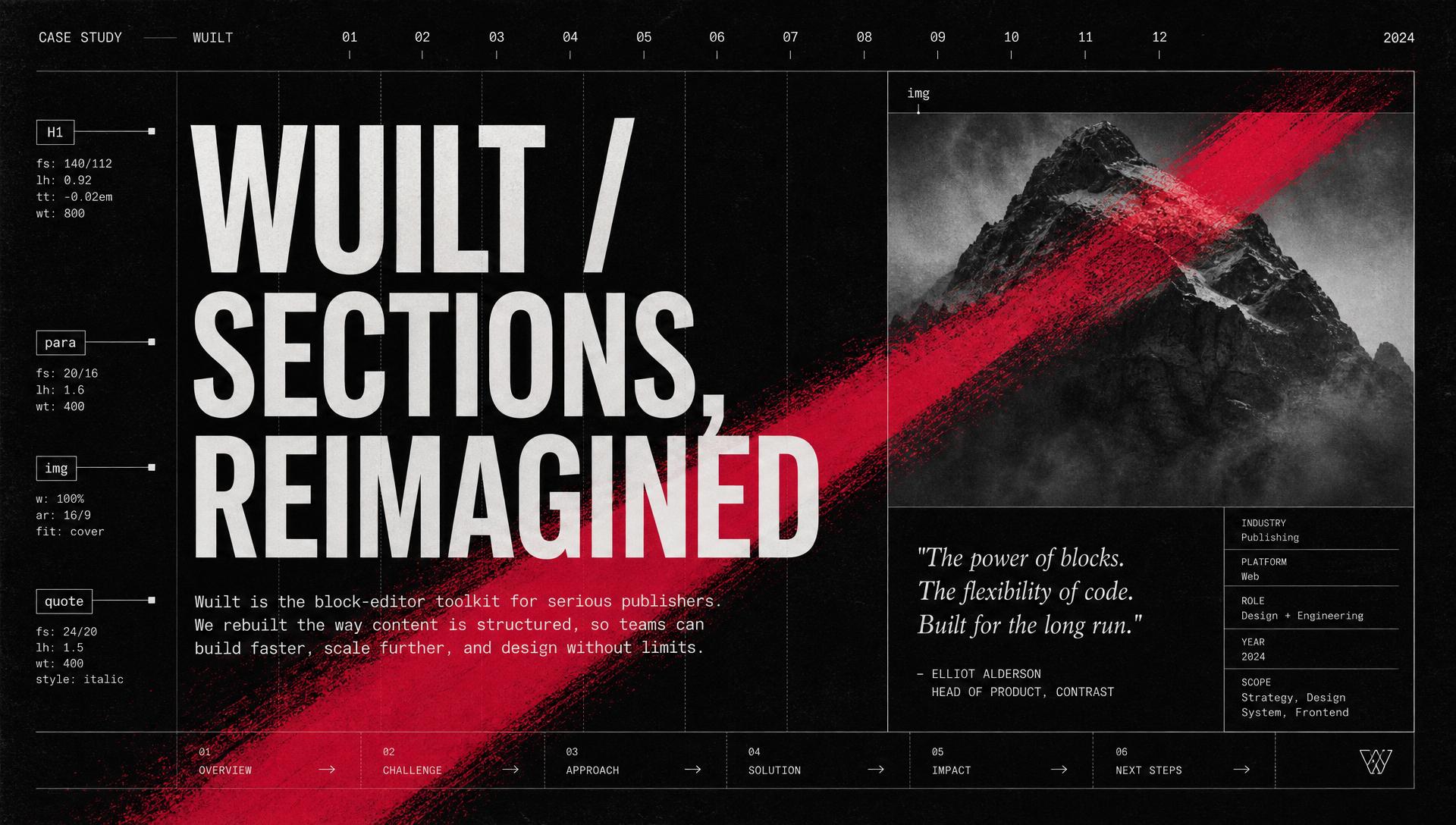
Wuilt — Site Styles, One Panel to Style a Site cover
Product · Design System2025

Wuilt — Site Styles, One Panel to Style a Site

Wuilt (No-code Website Builder)

A theme engine that lets non-designers style an entire website — colors, type, buttons, forms, motion — from one calm panel, with a live preview that never lies.

Overview

Wuilt is a no-code website builder used by small business owners, freelancers, and agencies. Site Styles is the theme system I designed to govern every visual token on a user's site — colors, typography, buttons, form fields, and motion. It ships two altitudes in one surface: a curated theme picker for people who just want their site to look right, and a per-token editor with an advanced overrides layer for people who want to fine-tune every corner. Every change is previewed live on the actual page, saved themes are first-class, and there are safe escape hatches (discard, reset, delete) at every branch.

The problem

Changing a Wuilt site's look meant editing colors, fonts, buttons, and forms on separate screens with no shared preview. Beginners were overwhelmed by choice and afraid to click anything. Power users hit ceilings on advanced palettes and per-heading control, and rebuilt the same themes for every new client. The system needed to serve both audiences without splitting into two products — and every change had to be visible, reversible, and safe.

Process summary

  • 01Mapped seven canonical flows and 11 branch points so no state could become a dead end.
  • 02Split the panel into two altitudes — curated theme picker for speed, per-token editor for depth — sharing one live preview.
  • 03Modeled colors as brand / secondary / base / accent groups with an Advanced layer for per-heading and per-button overrides.
  • 04Designed the button, form, typography, and animation editors to share layout, vocabulary, and preview position — learning cost paid once.
  • 05Built shared confirmation modals for apply, delete, discard, and reset so state changes stay predictable across the whole flow.
  • 06Shipped a component library (button, form field, select, color picker, modal) with every variant, size, and state tokenized and spec'd.

Screens

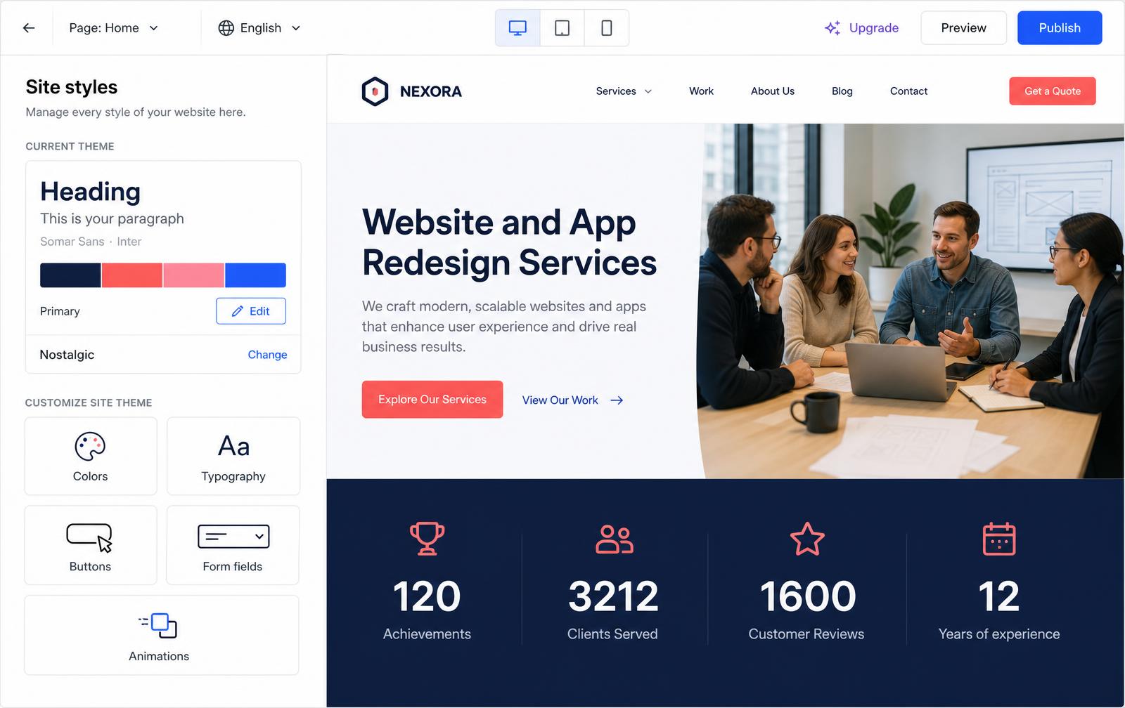
Site styles — the entry surface. Current theme card plus tiles for Colors, Typography, Buttons, Forms, Animations.
01Site styles — the entry surface. Current theme card plus tiles for Colors, Typography, Buttons, Forms, Animations.
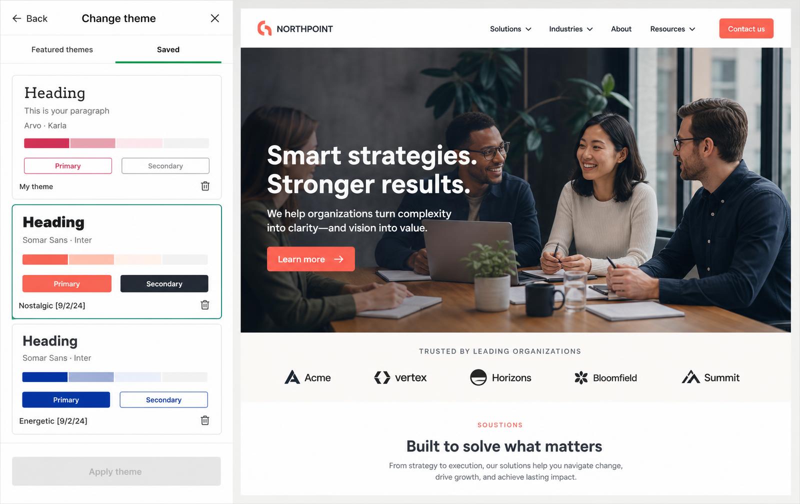
Change theme — featured themes and the user's saved themes, with delete and apply actions.
02Change theme — featured themes and the user's saved themes, with delete and apply actions.
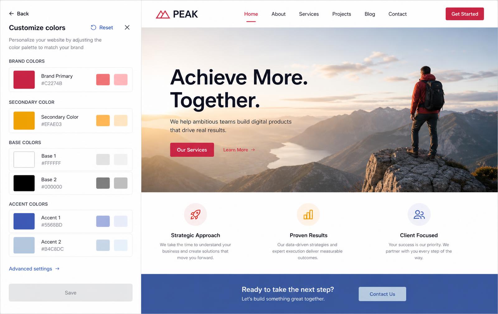
Customize colors — brand, secondary, base, and accent groups, each with generated shades.
03Customize colors — brand, secondary, base, and accent groups, each with generated shades.
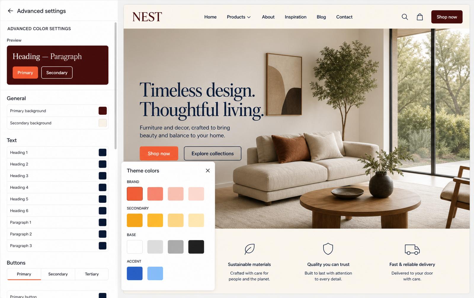
Advanced settings — per-heading text colors, background pairs, and a theme-colors picker overlay.
04Advanced settings — per-heading text colors, background pairs, and a theme-colors picker overlay.
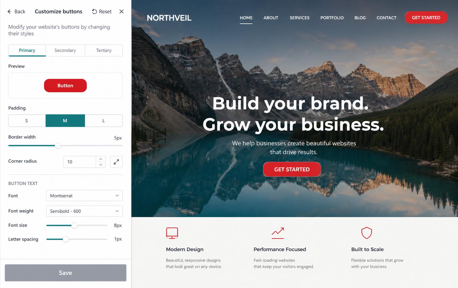
Customize buttons — Primary / Secondary / Tertiary tabs with padding, radius, and typography controls.
05Customize buttons — Primary / Secondary / Tertiary tabs with padding, radius, and typography controls.
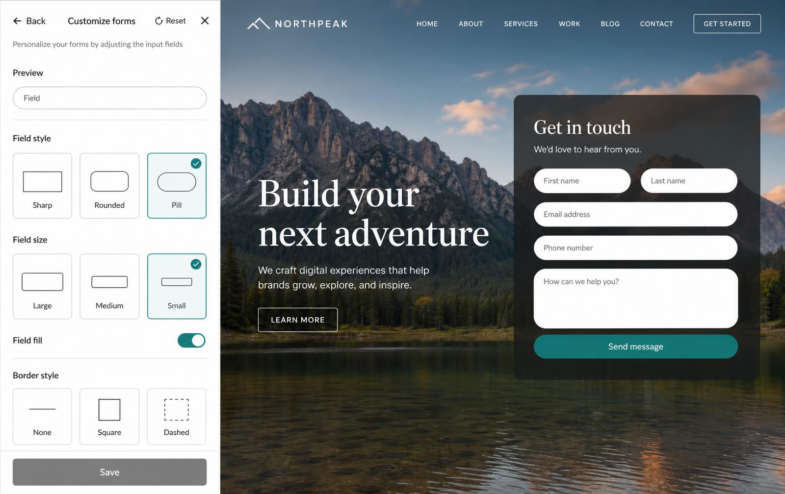
Customize forms — field style (Sharp / Rounded / Pill), size, fill, and border style.
06Customize forms — field style (Sharp / Rounded / Pill), size, fill, and border style.
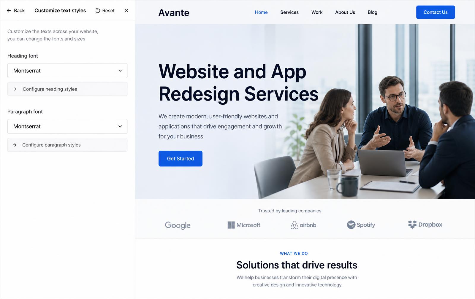
Customize text styles — heading and paragraph fonts with drill-in configuration.
07Customize text styles — heading and paragraph fonts with drill-in configuration.
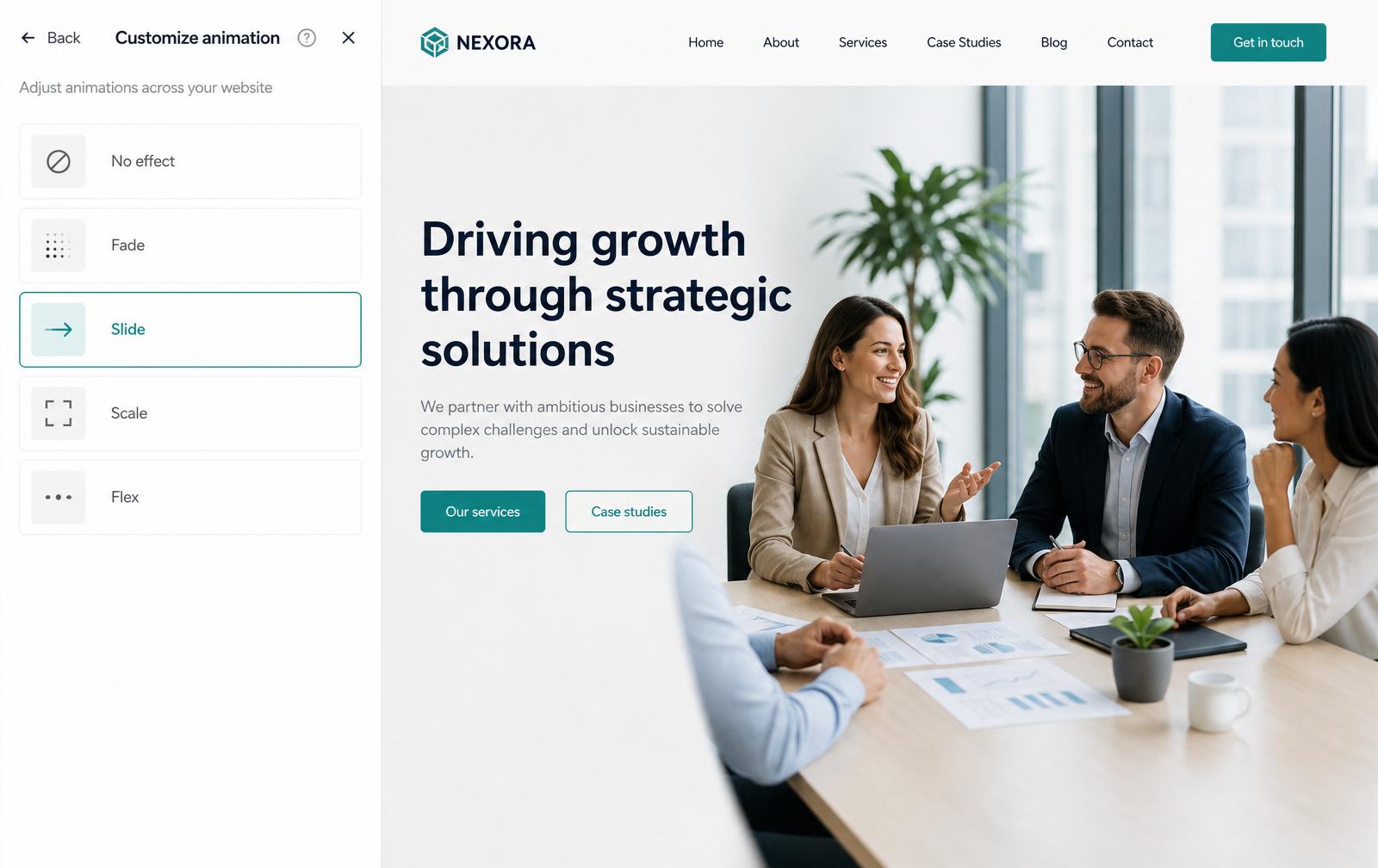
Customize animation — one control for the site's motion register, from No effect through Flex.
08Customize animation — one control for the site's motion register, from No effect through Flex.
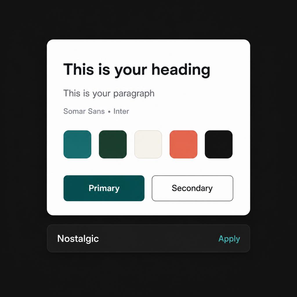
Component — Theme card. Shared preview of heading, paragraph, palette, and buttons across every theme.
09Component — Theme card. Shared preview of heading, paragraph, palette, and buttons across every theme.
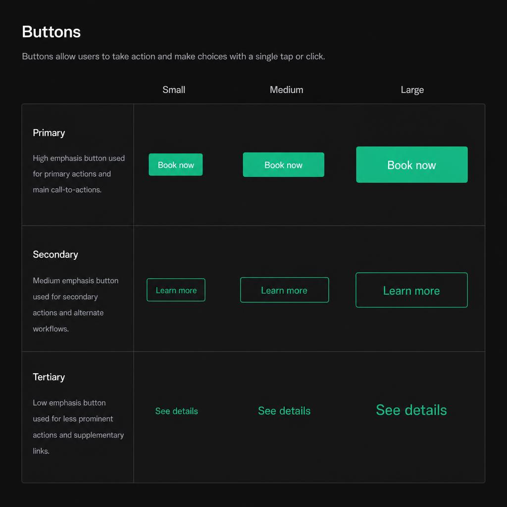
Component — Buttons. Primary, secondary, and tertiary variants across S / M / L sizing tokens.
10Component — Buttons. Primary, secondary, and tertiary variants across S / M / L sizing tokens.
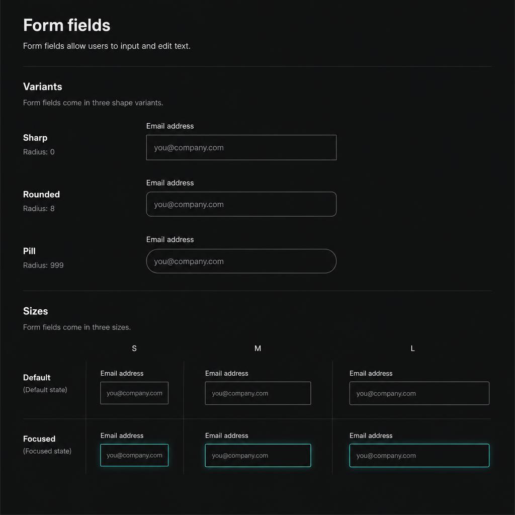
Component — Form fields. Sharp / Rounded / Pill shapes, three sizes, default and focused states.
11Component — Form fields. Sharp / Rounded / Pill shapes, three sizes, default and focused states.
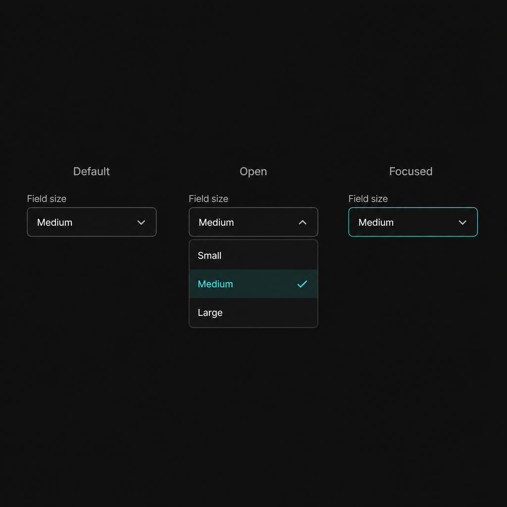
Component — Select. Default, open, and focused states used across every editor panel.
12Component — Select. Default, open, and focused states used across every editor panel.
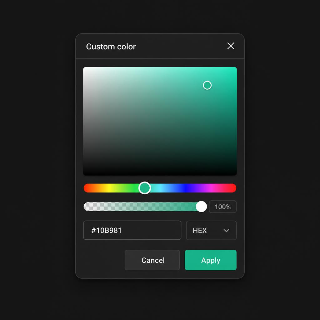
Component — Color picker. Custom color popover with hue, opacity, hex input, and apply / cancel.
13Component — Color picker. Custom color popover with hue, opacity, hex input, and apply / cancel.
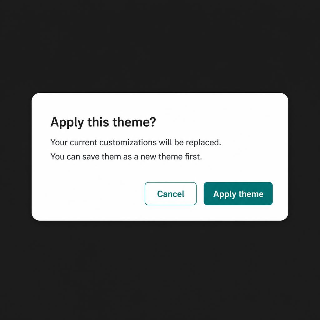
Component — Confirmation modal. Shared pattern for apply, delete, and discard-changes flows.
14Component — Confirmation modal. Shared pattern for apply, delete, and discard-changes flows.